How to create a bespoke typeface for your brand
Luke WoodhouseFollowing our Creative Director’s recent piece on bespoke type, and the plethora of global brands launching their own creations, a few people have been asking how to do it. Here Luke explains how to go about creating your own brand font.
07.01.20
Why bespoke
First impressions count, and the typeface can often be one of the first things people notice about a brand. For this reason, font selection is a critical part of the creative process, as a brand needs to ensure that its chosen typography represents its personality. Is it serious or playful? Welcoming or austere? Informal or corporate?
While there is a vast array of existing typefaces already on offer, sometimes the best route is for a design agency to craft a bespoke typeface that captures the nuances of a brand’s identity. This way, all elements of the brand will work in harmony, from the colour palette and logo to tone of voice and typeface. Simultaneously, wherever the typeface is used, it will be instantaneously attributable to that brand.
Type that tells a story
It’s an approach we’ve taken on a number of our own projects.
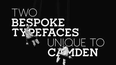
For Camden Market, we created a suite of typefaces all based on the letterforms of the iconic Camden Lock sign. This helped us brand the market in an authentic way, without having to plaster the logo everywhere.
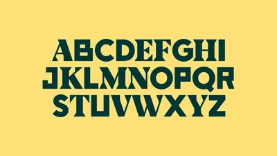
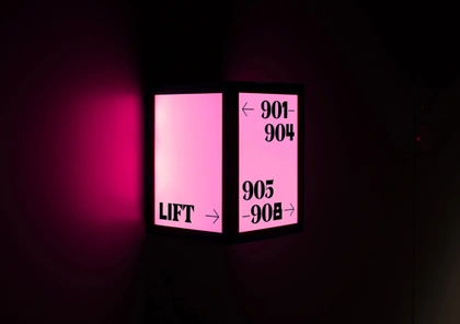
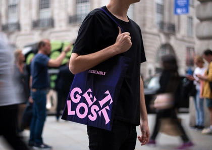
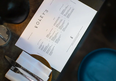
And for Assembly, we created a bespoke font to communicate the diverse range of experiences on each hotel’s doorstep. Bespoke display typefaces for Foley’s helped tell the brand story in a uniquely identifiable voice.
So, where do we start?
Step 1: Guiding principles
As with all decisions in the curation of a brand’s identity, the design of a bespoke typeface needs to be rooted in the wider strategy, and consequently the design process can only begin later down the line when the strategic outline is in place.
The core brand identity acts as a set of guidelines for the design team, shaping the character and personality of the lettering and ensuring that it’s appropriate for the wider brand. If a client is investing in bespoke typography, we need to ensure that it reflects their ethos and character to the finest detail.
So, once the strategy is in place the fun bit can begin – sketching out the concepts for the alphabet.
Step 2: The fun bit
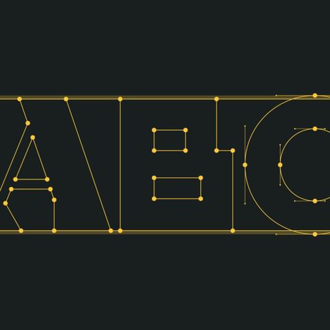
Here the possibilities are endless. Some projects – such as our unbranding of Camden Market – only need capital letters and display size fonts which makes it a bit more straightforward, while others may need to be available across multiple languages such as Russian or Greek where alternative lettering is needed. Once we have the overall concept sorted and the beginnings of a working typeface, the next step is to get into the detail.
Cue an investigative stage where the typeface is explored in a range of different weights and formats, with the number of letters created sometimes edging into the thousands. There are also softer, more psychological elements to consider. The use of serif, for example, can evoke a warmth or an association with craft, whereas sans serif is considered to be more contemporary.
When it comes to timing for these initial stages it very much depends on the complexity of the project but often it will take around a month with a small army of designers to complete a full alphabet, and much longer for bigger projects.
Step 3: Does it work in practice?
Now we have a working typeface we can move onto the more technical aspects, analysing how it’s performing in practice. This can include whether ligatures are working properly, for example checking to ensure that the arch of a lowercase “f” engulfs the dot above an “i”, and assessing the legibility at various font sizes.
We will also be looking to test whether there are any coding issues, making sure that the typeface works across different programmes and platforms such as an app versus a website, and hinting to check how it renders across pixels on a rasterised grid.
Big brands are leading the way
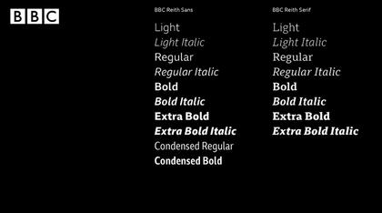
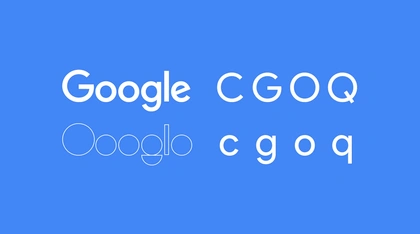
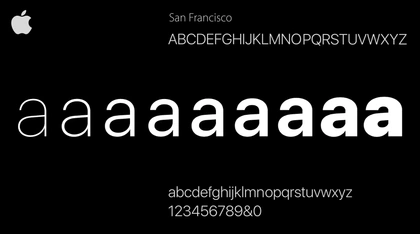
With big brands now embracing their own bespoke typefaces – from Apple to Google, and more recently YouTube and the BBC – and the introduction of disruptive technologies such as Prototypo, a bespoke font generation app that enables companies of all sizes to experiment with their own fonts, there is no doubt that the popularity of bespoke typography is on the rise.
For these larger companies, the introduction of bespoke typography can act as a unifying force, creating uniformity across the diverse sub-sections of a complex business model.
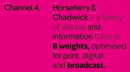
This approach enables a softer, more subtle form of branding, allowing companies to whisper rather than shout who they are – demonstrated with aplomb by Channel 4 on multiple occasions over the years, first with Fontsmith around 15 years ago and more recently by Neville Brody and Luke Prowse, whose bespoke typeface embodies the creative risks inherent to the channel’s appeal.
What underpins the success of these stylistic choices however is how a new typeface integrates the core brand identity. Only with a clear understanding of a brand’s personality, values and ethos, can a bespoke typeface be truly fit for purpose.
