East London Liquor Co.
ELLC committed to fighting spirit. With a rebrand that stands out by taking a stand.

East London Liquor Co. came to us as a bartender’s favourite. Their range of gin, vodka, rum and whisky had become a fixture in the nation’s best bars. But they had bigger ideas. To expand into RTDs. To be sold in supermarkets. And to build a brand that drinkers loved.
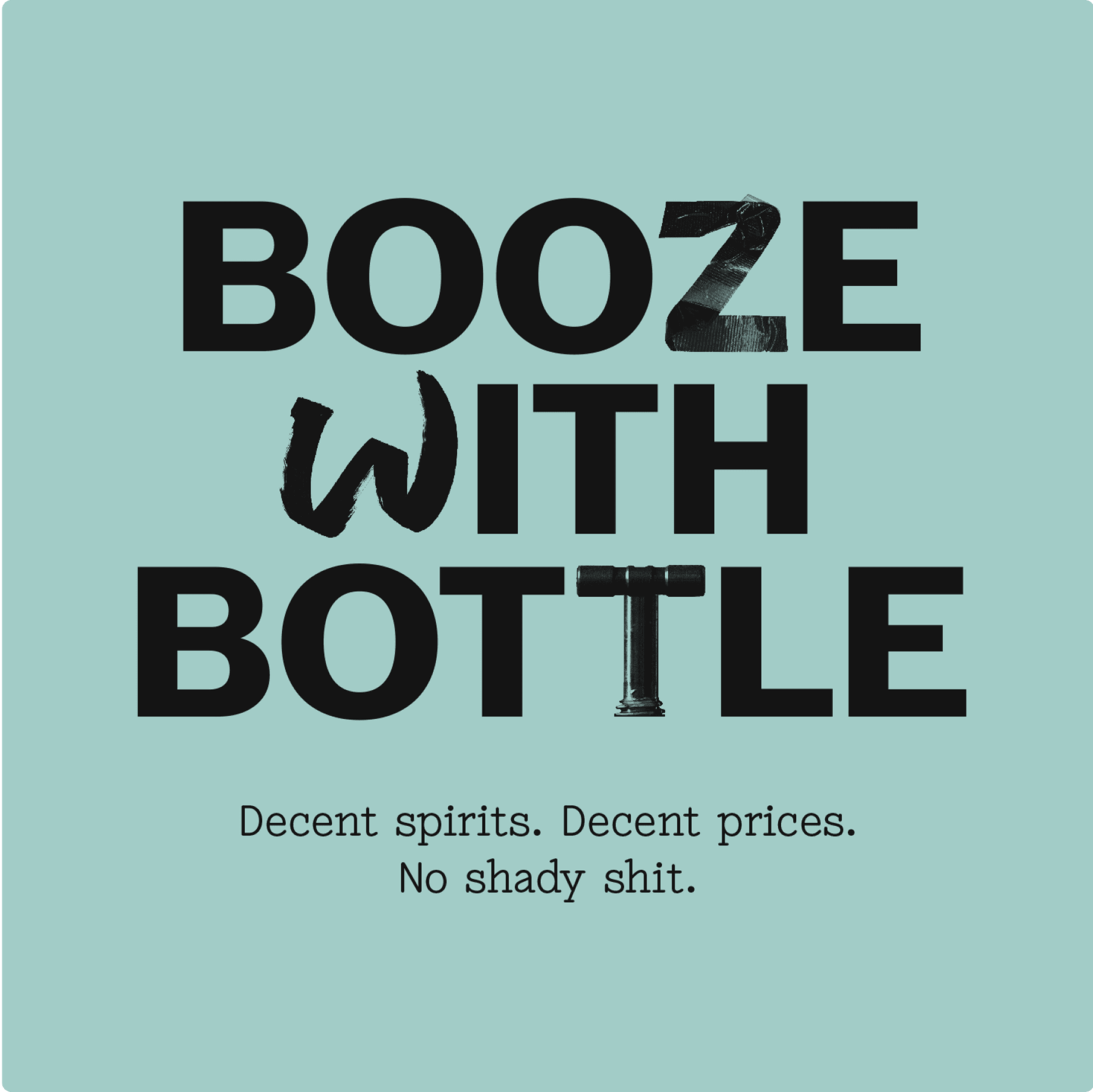
In an industry full of ‘botanical bathtub bullshit’ ELLC stands for something very different. Decent drinks, made by decent people, at a decent price.
Overview
The partnership
A full rebrand to put ELLC into the hands of drinkers everywhere. New packaging for the brand’s entire portfolio, including a new range of RTDs. And a collaboration across naming, messaging, photography and much more.


Define
There are about 5,000 gins produced globally. Not to mention all the vodkas, rums and whiskies. And most follow the same tired formula, justifying high prices with crafty marketing. Standing out meant speaking out. Unapologetic and unabashed.

The idea
The ELLC brand is built on fighting spirit. It’s an attitude that goes far beyond communications, driving everything from hiring to NPD.

Create
We stripped away the conventions of craft spirits and went back to the brand’s roots. A defiant identity born on the streets of East London. From type to tone of voice, ELLC is an antidote to the overhyped and underwhelming.


Verbal identity
ELLC is unafraid to call out craft bullshit. Outspoken headlines are set in a custom typeface that takes inspiration from the distillery and the surrounding area.


Smiler
Every revolution needs a symbol. The fluro yellow smiler icon puts the brand’s east London distillery on the map.


Art direction
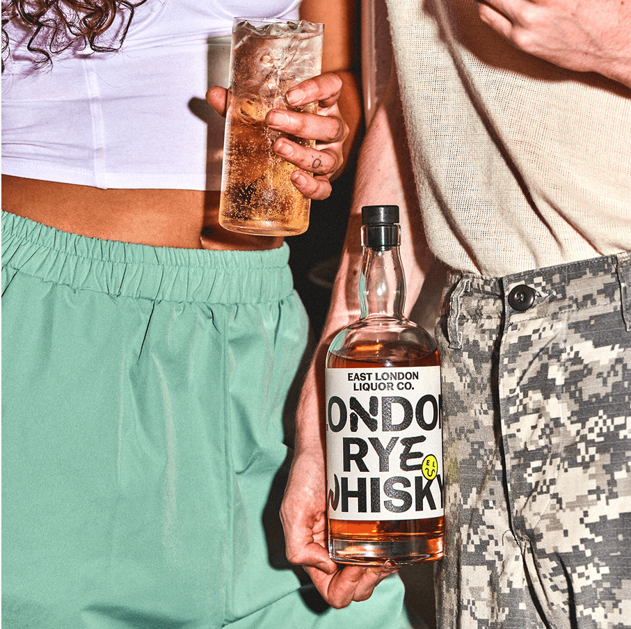
Photography, created with Charlie McKay, is a candid contrast to the stylised imagery of the category.


Commit
The core spirits packaging was a chance to make a statement: unapologetically stripped-back with the occasional premium flourish. A new RTD (ready to drink) range brazenly ignores convention in favour of shelf stand-out.


The different reality
The brand relaunch changed ELLC for good. A point of view they could commit to. An identity to get them noticed. A new range of RTDs. Complete with listings in Tesco, Waitrose and retailers across the globe.

We knew we needed more than an identity. We came to Ragged Edge because we wanted to transcend a category that had got lost in its own hype. They lived up to their changemaker reputation, pushing us way, way beyond what even we thought possible.
Decent spirits by decent people
Bold work needs a brave client. Alex and the ELLC team are the embodiment of fighting spirit. The typeface was created in close collaboration with NaN Foundry. And the lifestyle imagery was shot by the Charlie McKay.
Industry recognition for the ELLC rebrand
D&AD Awards
Writing for design
Brand voice
Wood pencil
D&AD Awards
Typography
Integrated
Shortlisted
D&AD Awards
Packaging design
Rebrand
Shortlisted