Go.Compare
Go.Compare committed to good decisions. With a rebrand that positions them as the champions of choice.
With 97% awareness, Go.Compare isn’t just a leading price comparison website. It’s one of the UK’s most recognisable brands. But in a ruthlessly transactional market, Go.Compare needed to be more than just famous. They needed people to actively choose them.
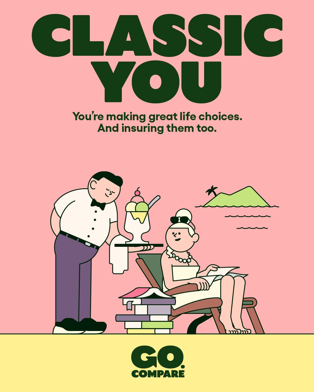
Our rebrand exaggerates the brand’s distinctive assets, including its (in)famous mascot, to position Go.Compare as the champions of choice.
The partnership
A full rebrand that reframes Go.Compare as the champions of choice. A new website and a full suite of campaign assets. And an ongoing collaboration with the Go.Compare design team.
Define
To get people to choose Go.Compare, we first needed to define what makes them different. While the rest of the market competes on surface gimmicks, Go.Compare puts its customers’ needs first. As the only BIBA accredited price comparison website, you can trust that you’re choosing from all the right options.
So we framed the brand as the champions of choice.
Create
With an animated version of Gio at its heart, the visual and verbal identity makes Go.Compare a charming choice champion. It’s simple, scalable and single-minded, designed to amplify the brand’s hard-earned fame.
Name
With the battle of the advertising budgets extending to search engines, what if we could get customers to skip the search and go direct? Go Compare became Go.Compare. A name and a URL in one. A counter-intuitive change, but one that’s paid off handsomely.
Mascot
Gio, the brand’s notorious mascot, perfectly personifies the strategy. By exaggerating his distinctive features in cartoon form, we created a character that could live in every part of the experience, from button to billboard.


Illustration system
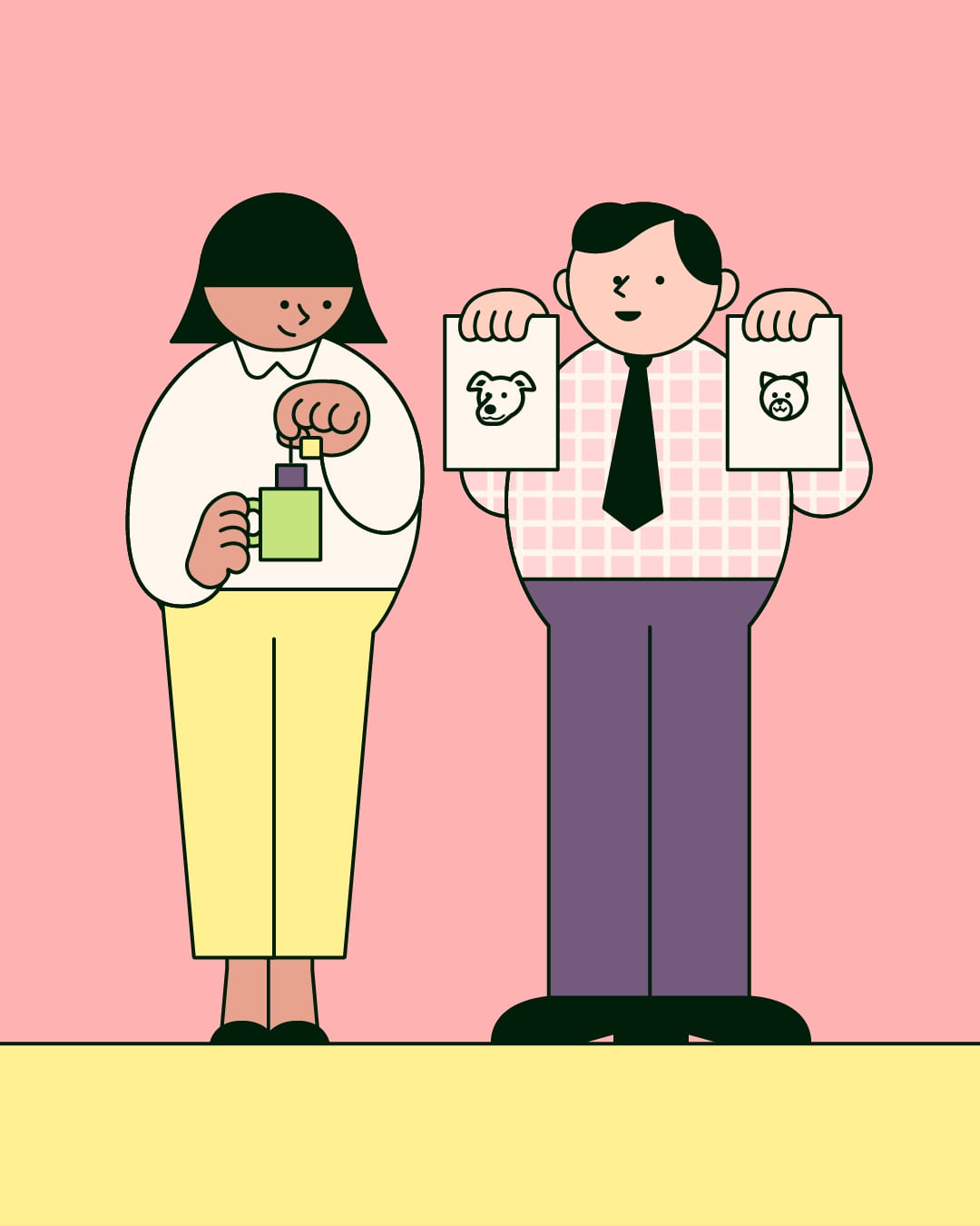
In a category where stock imagery rules, we extended Gio’s distinctive illustrative style across a suite of situations, created in collaboration with Rami Niemi, to bring Go.Compare’s insurance products to life in an entirely new way.
Verbal identity
The voice of choice connects with customers through a relatable wit. All expressed in a bespoke typeface, designed to echo the warm and characterful style of the illustrations.


Commit
Working with the Go.Compare brand team, we helped put the reimagined Gio on TV, in stadiums, on social and – just as importantly – in the product. A joined-up, scalable experience for a brand that has become much more than an operatic earworm.


The different reality
The rebrand laid the foundation for high profile partnerships, with both ITV and the Welsh Rugby Union, driving awareness and, crucially, likability. Most importantly, the brand delivered a record year commercially with revenue of £158 million.


Ragged Edge worked closely with every part of our business to ensure they understood exactly what our aspirations were and how we wanted to evolve in the future. Insurance can be heavy going – a grudge purchase. Ragged Edge has made it fun and rewarding! The rebrand has helped us to evolve visually and strategically and given us an even stronger sense of purpose, authority and momentum as we continue to provide transparency and support for customers across a broad range of complex products.