Tilt
Tilt committed to working people. With a rebrand for their new credit system that levels the playing field for millions of Americans.
Over 100 million hard-working Americans can’t get reliable access to fair credit, limiting their financial mobility and keeping them stuck in survival mode. Predatory payday loans and expensive overdrafts feel like the only options. Tilt entered the space in 2016 (as Empower) to change this. A new way to access cash without relying on credit checks, interest or late fees.
Armed with innovative underwriting, Tilt has expanded their range of products for people to graduate through. The brand needed to change with the business. From a quick fix for those in crisis, to a financial partner for the climb.
Overview
Partnership
A new name and brand for their new credit system and set of credit products. Collaboration across the full brand: positioning, naming and identity.
Define
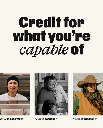
Collaborating closely with the Tilt leadership team, we unearthed a belief in people that runs even deeper than their product. Just like their intelligent underwriting (that considers people on 250+ non-traditional signals of financial health), the Tilt team values endeavor above all else.
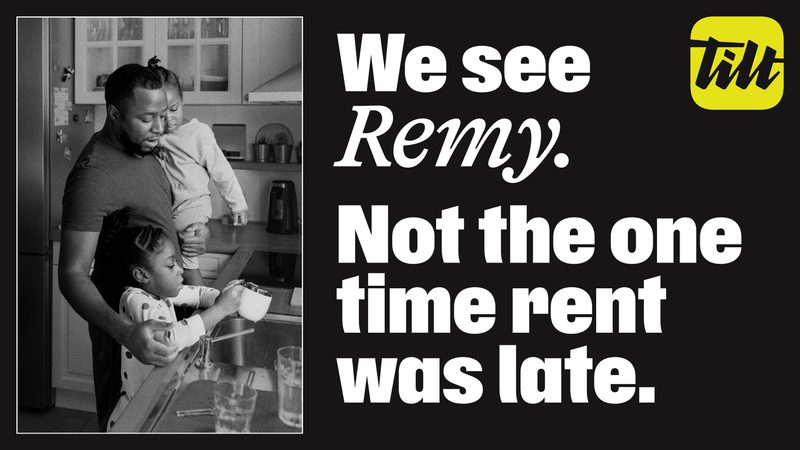
The brand was shaped around this faith. Instead of judging people on what’s come before, Tilt credits them for what they’re capable of. Because they’re good for it.
The idea
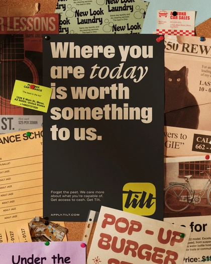
Built on an innate belief in people, Tilt backs the working whatever they’re working towards.

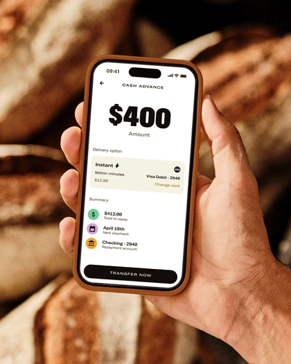
Create
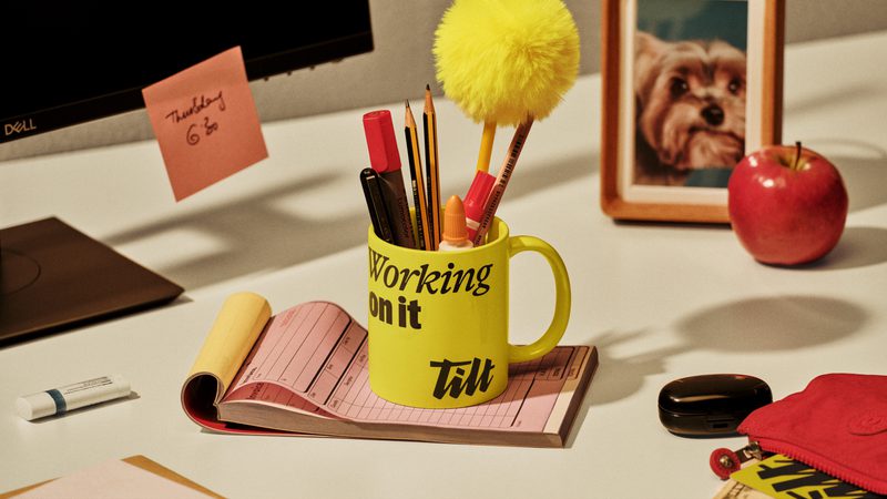
A new name and identity for a brand built on fairness. One that lays its trust in people out in black and white. This identity is a tilt towards a world that backs human endeavor.
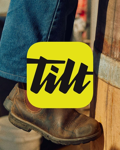
Name & logo
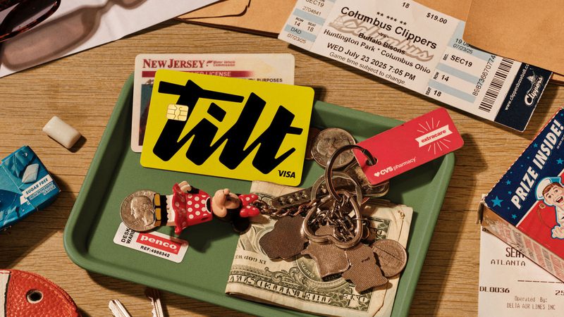
The need for a new name presented an opportunity to double-down on the mission: tilting the odds back in favour of the often underestimated. A signature-style logo reinforces the commitment to that promise.
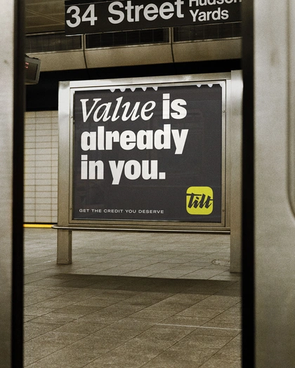

Verbal identity
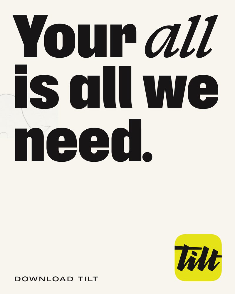
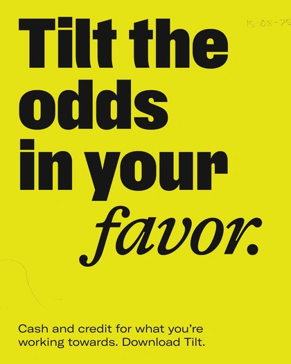
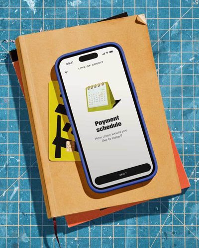
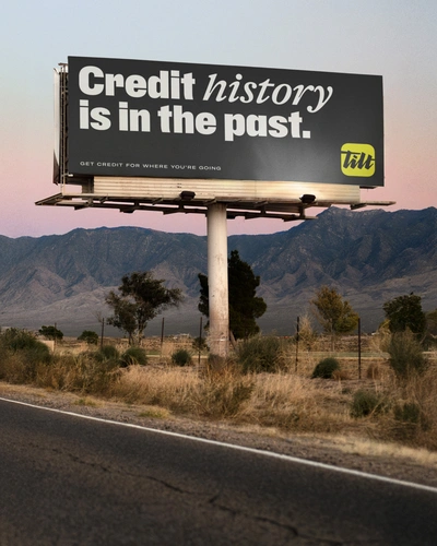
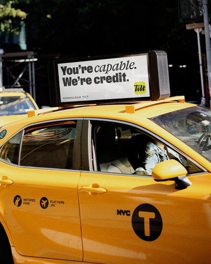
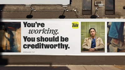
Soulful, intelligent and unwavering. People don’t need another friend. This is a brand to kick down doors.


Typography
A customised headline script allows the brand to show urgency with a literal tilt.

Commit
With the brand defined, we took a consultative role and supported the talented Tilt team as they designed and built a new website and product. Meanwhile we worked with Pearl Chuaynarong and the product team to bring her illustration style to life across the experience.
Illustration suite
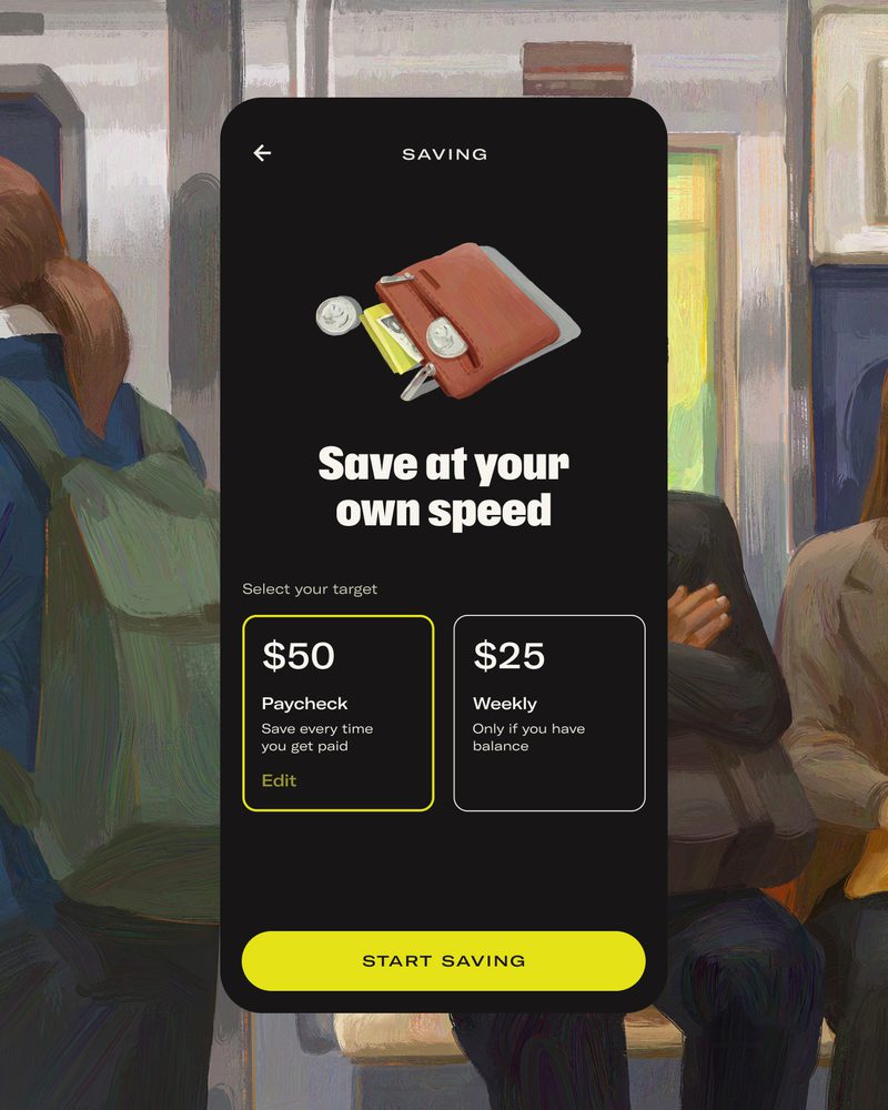
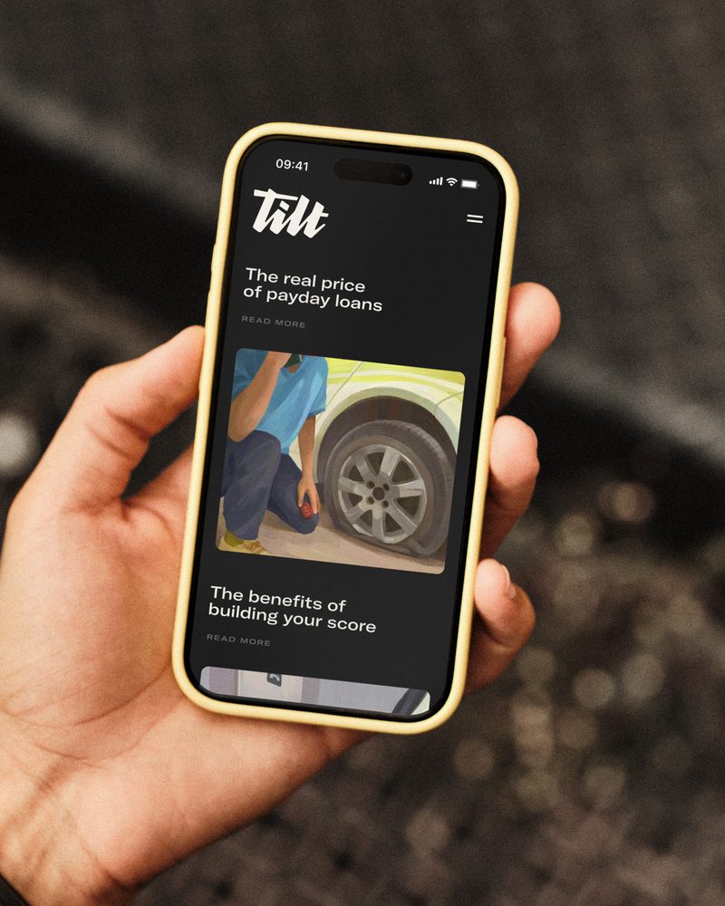
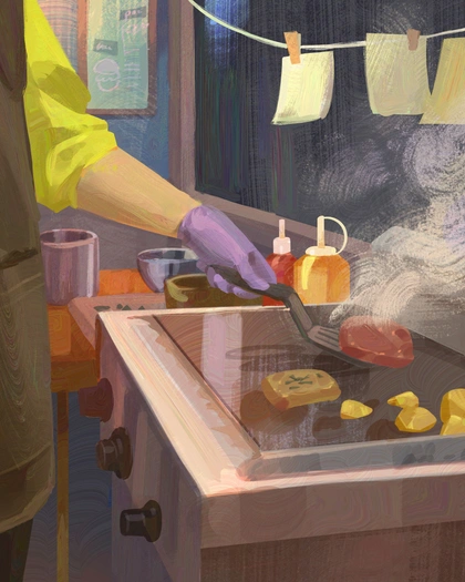
Instead of shying away from it, illustrative brushstrokes embrace the messiness and imperfection of human effort. A series of spot and scene illustrations for product and marketing were created in collaboration with illustrator Pearl Chuaynarong.

The different reality
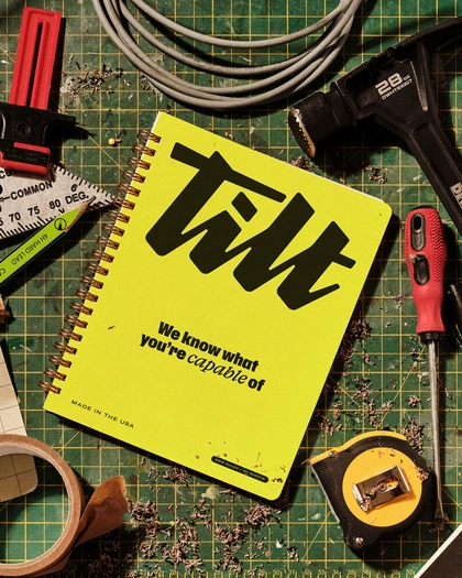
The new brand aligns the team and rationalises Tilt’s recent acquisitions, which will further accelerate access to fair credit for all. Externally the brand has seen impressive traction, with 70% higher click through rates on Meta and zero downtime on acquisition.
We believe financial opportunity should be within everyone’s reach. Our underwriting and products make it possible, and now our brand makes it unmistakable. With the new Tilt identity, Ragged Edge captured not just who we are now, but who we aspire to be.
This was never a paint-by-numbers rebrand. Ragged Edge brought sharp insight and fearless creativity and balanced listening with challenging, pushing us to go past our comfort zone. They gave Tilt a voice and look that cuts through the noise and feels alive with possibility.
To powerful people
Thank you Warren, Stephanie, Ben, Pawel, Lucie, Noah and Alaina, for your trust. And thank you to our collaborators Pearl Chuaynarong and Charlie McKay.