Camden Market
Camden Market committed to unfollowing convention. With an unbrand to reinvigorate the iconic destination.

With 28 million visitors a year, Camden Market is London’s fourth most popular tourist destination. Facing competition from a new wave of retail destinations across the city, the market’s famous punk spirit had been lost among tacky souvenirs and overpriced tat.
As part of a major regeneration project, we helped Camden Market unify its brand by rejecting corporate conformity.
Overview
The partnership
A full rebrand including brand strategy, architecture and an identity that united the markets under a single brand. Bringing punk spirit back to Camden’s future.

Define
We immersed ourselves in the Market. With its owners, residents, workers and visitors. Together we found a common enemy: corporate conformity. And an idea true to its past, present and future.

The idea
Part entrepreneurial, part anarchic, the brand idea is a call to action for everyone, from tourists to stallholders.
Create
A market with such an irrepressible spirit didn’t need a strict brand system. Instead we created an ‘unbrand’. Distinctively Camden, resolutely individual.


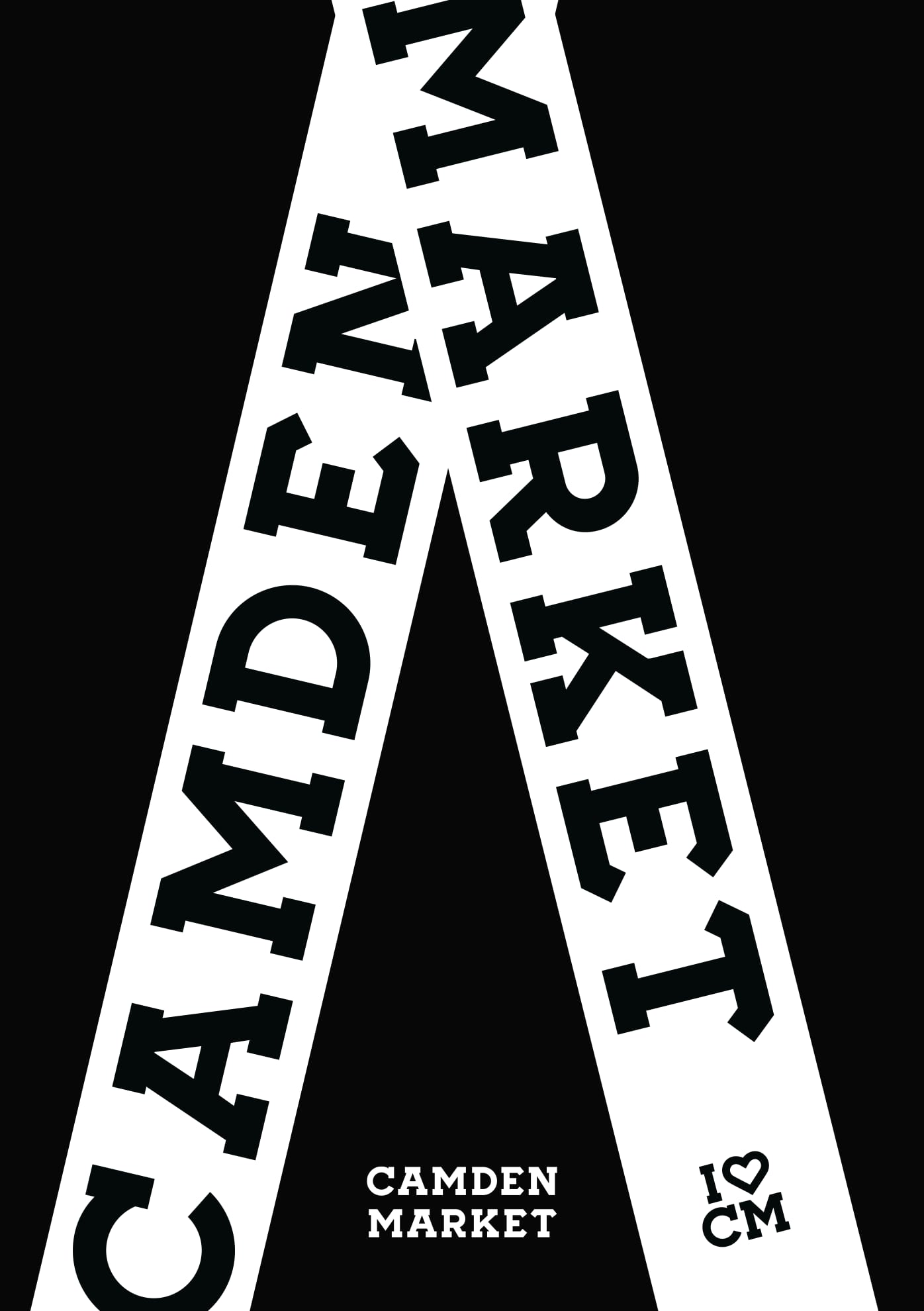
Logo
Hand-painted by John Bulley in the 1980s, the iconic Camden Lock sign was the market’s unofficial logo. We made it official, creating a new wordmark based on Bulley’s original letterforms.

Bespoke typography
The logo informed two bespoke typefaces, a slab serif and a sans serif in multiple weights. Giving the Market a brand asset that was endlessly flexible. Across tone and touchpoints alike.


Brand architecture
Camden Market was actually a collection of individual markets, all with their own names and identities. In an already cluttered environment, the approach only added to the noise. So we unified the markets under a single visual brand.


Commit
Camden’s refusal to follow rules meant prescriptive guidelines were a no-go. Instead we armed the internal team with a kit of parts and a simple call to action. Experiment.


The different reality
A decade later, the brand lives everywhere. ‘Unfollow Convention’ has driven retail strategy right through to comms and content. The Market was recently rumoured to be offered for sale at a value of £1.5 billion, a £1.1 billion increase on its purchase by the current owners, LabTech, in 2014.

Camden has long been intertwined with radical thinking. So Ragged Edge were the obvious partners. Their unbrand gave us the perfect platform to create the Market’s future, while still aligning with its long history of new ideas.
Industry recognition for the Camden Market unbrand
D&AD Awards
Camden Market, Branding, Branding Schemes, Wood Pencil
Transform Awards
Camden Market, Best Place or Nation Brand, Gold