First Choice
First Choice committed to making picky a positive. With a rebrand to attract a new generation of travellers.
First Choice has been a holiday icon for 30 years. First on British high streets, and then online as part of the TUI group. But with younger travel lovers demanding increasingly more from their time off, it was time to move beyond the brand’s all-inclusive past.
Our challenge was to redefine First Choice for a new generation. And reposition the brand to stand out amongst the overwhelming options online.
Overview
The partnership
A full rebrand to help First Choice to speak to a new audience, and stand out amongst an overwhelming range of options online.
Define
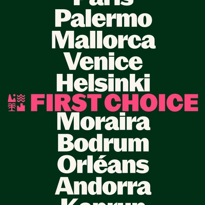
In an age of unlimited options, most holiday companies make choosing a chore. The brand strategy for First Choice is different. No more penalisation for picking what you really want from your holiday. Instead, start with your interests or preferred destinations, and tailor a complete experience that’s built just for you.
The idea
Want to go wild in Ibiza or get mellow in The Maldives? Do it DIY or make it VIP? Take your beach bag or your backpack? Whatever holiday you want, get picky with First Choice.
Create
With a new product offering a more flexible, personalised experience, the new identity encourages travellers to get picky.
Design system
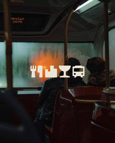
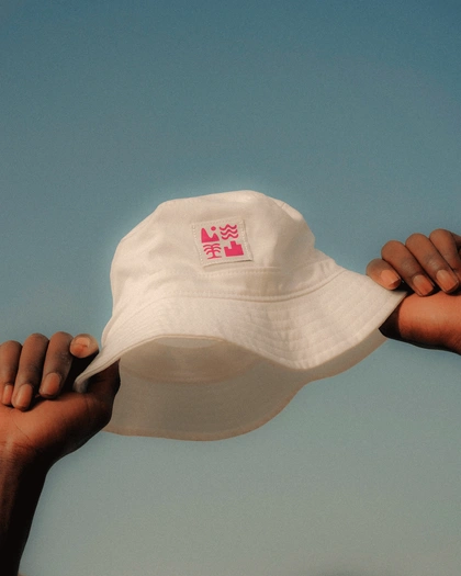
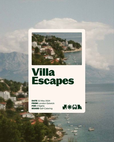
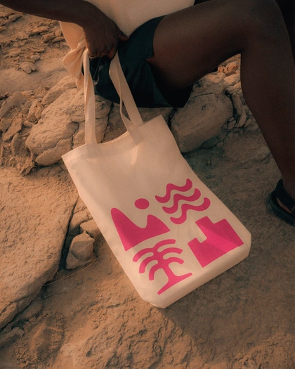
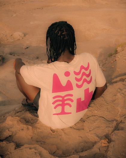
Built around a set of icons that represent the ability to curate the perfect combination of experiences for you. At the pool, up a mountain, in a city or by the sea. The choice is yours.
Verbal identity
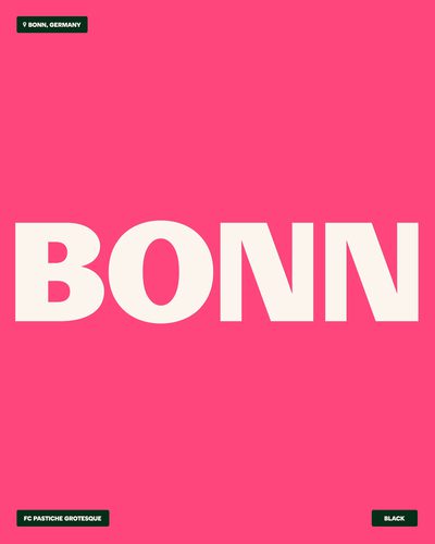
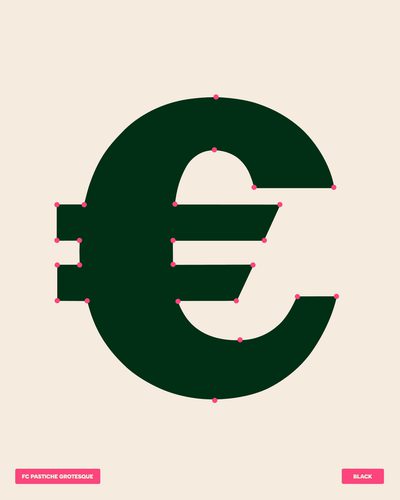
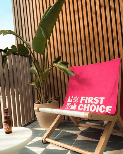
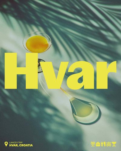
Copy encourages holidaymakers to be proudly picky. Taking them from the First Choice website to the holiday they really want with ease. All set in a customised headline typeface that embodies a newly confident brand character.


Art direction
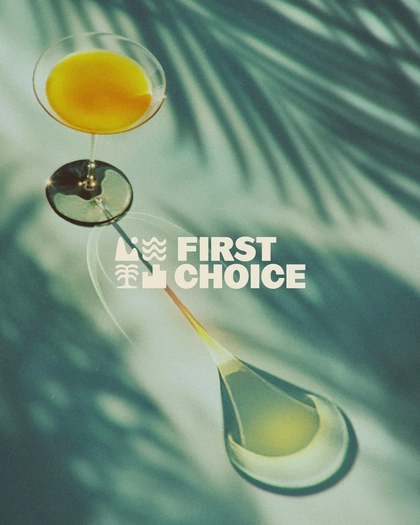
In a category full of soulless drone shots, the art direction gets up close and personal with holidaymakers. The only perspective that matters is theirs.
Commit
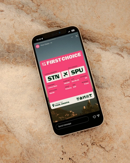
With the identity defined, we worked closely with the First Choice team and a range of partners to relaunch the brand. A new website, digital product and brand campaign doubled down on the new positioning.
The different reality
The brand strategy continues to drive everything from product features to partnerships. A Flight-Free option gives travellers a sustainable way to be picky, while First Choice Flex offers choices with less commitment. And a range of creator partnerships showcase pickiness at its best.

A journey to remember
This trip wouldn’t have gone as far without the bravery and collaboration from the First Choice team. Thank you Bart, Sara, Kristen, Craig, Steph, Lisa, Conrad, Ella, Kev, Abi, Sara Ali, Lee, Christian and Molly. Thanks also to Order Type Foundry who helped us customise Pastiche Grotesque for the headline typeface.