Gaia
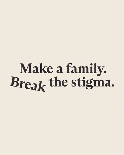
Gaia committed to a fair way to make a family. With a rebrand to break the stigma around IVF.
Infertility affects 1 in 6 couples. But with aspiring parents spending an average of £14,000 for their treatment, IVF remains an expensive last resort. Gaia is changing that. With a first-of-its-kind prediction of your unique chances to have a child. And a personalised insurance plan that eliminates the huge upfront cost typical of treatment.
As Gaia prepared to launch across the US, the rebrand aimed to give people agency over their fertility. And break the stigma around IVF.
Overview
The partnership
A full rebrand to speak to a new generation of families in the US and beyond. And a collaboration with the Gaia team to help the brand live across every touchpoint.
Define
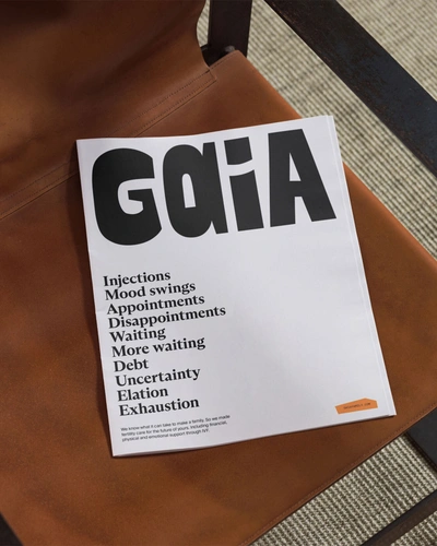
In-depth interviews revealed a sobering story. IVF is seen by many as an expensive, exhausting, stigmatised last resort. Gaia is changing that. The brand needed to help realign expectation with reality – predicting what’s probable, rather than promising what’s possible. Reflecting parenthood not simply as an instinct we follow, but as a choice we can make that requires strength of character and resilience. And finally, crushing stigmas surrounding IVF, meaning everyone’s journey to and definition of family is no less natural, no less normal.
The brief was to build the first brand for when men and women want to start a family. We wanted to change the system, not just make it better; for that, bravery was not optional. We needed to partner with someone as brave as us and certainly not afraid to break a rule or two.
Create
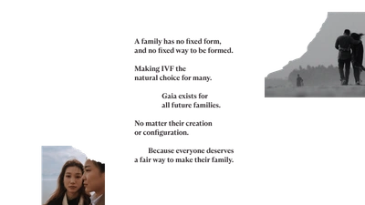
A family unit has no fixed form. Or a fixed way to be formed. And by offering full agency over reproduction, Gaia are the lifemakers here for all future families, no matter their creation or configuration. It’s this idea that inspired Gaia’s new brand identity.
Logo
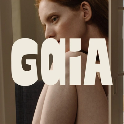
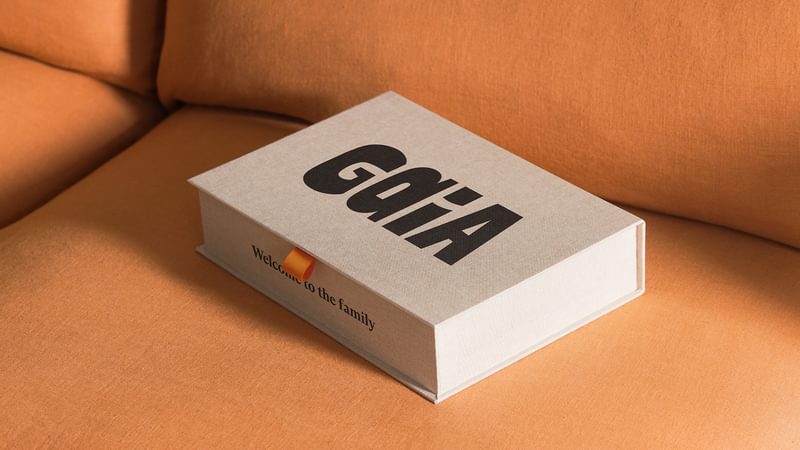
A signal that Gaia is something distinctly different. With two different letter ‘A’s reflecting how no two families are the same.
Collage
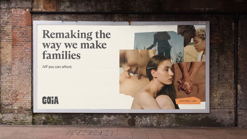
A visual device to show the rich, varied and often imperfect ways we make family. The approach is used for photographic compositions, as well as individual illustrations.
Verbal identity
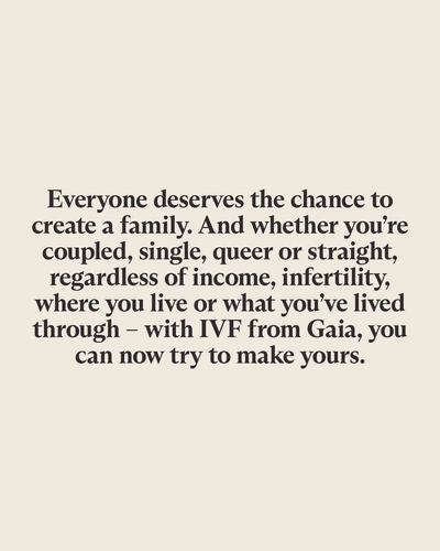
Bold, with bedside manner. The tone of voice allows Gaia to assert its point of view in the world while always supporting individual members.
Commit
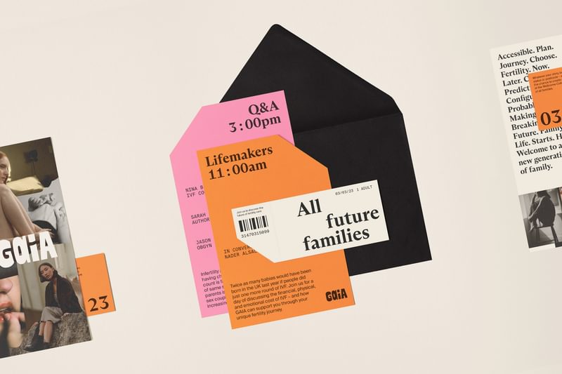
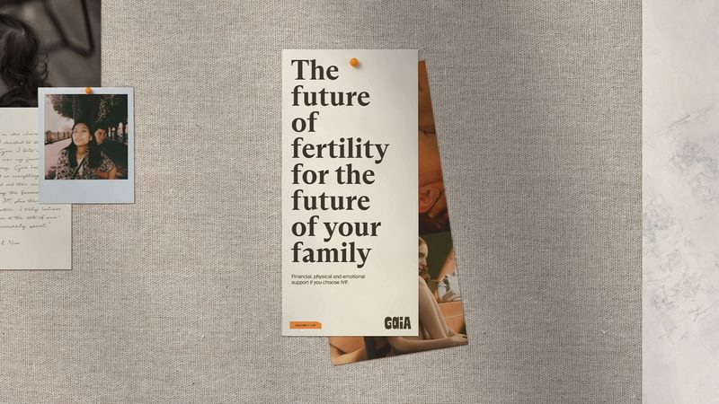
We worked with the Gaia in-house team to build a system that could grow with them. A two-way collaboration across the website, on social and in print.
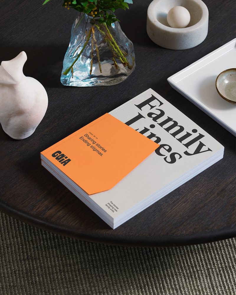
The different reality
The new brand launched in October 2022, as Gaia set out to grow their offer in the UK and launch in the US. In September 2024 they reached a significant milestone: the one hundredth Gaia baby was born. By the end of that year, they were operating in 57 locations through 23 clinic groups in the US. A $14 million Series B investment round followed in January 2025.
We loved working with the team at Ragged Edge. Their thoughtfulness and consistency of the experience stood out. Their level of care and empathy for the people whom we serve defines them and it shows in the work we have done together. It allowed us to create a brand that’s true to who we are, but big enough to carry who we’ll become.
A partnership built on trust
Alexia, Cathy, Christopher, Clem, Georgia, Ines, Joanna, Lucy, Marta and Nader – thanks to everyone at Gaia for their bravery, their honesty, and their trust. And thanks to Charlie McKay who shot all the lifestyle imagery you see here.