How to use colour to make your brand more recognisable
Max OttignonVisual identity conversations are often dominated by logos. They’re given the most attention during the branding process, and they’re fetishised by the design community. But are they your brand’s most important visual asset? Sometimes. But definitely not always.
15.01.20
Getting colour right
When you’re walking along a supermarket aisle, the first thing your brain processes is colour. And it’s the same thing whilst mindlessly scrolling Instagram, staring across a tube platform, or diligently browsing a price comparison website.
What do you notice when you come out of the tube at Bond Street — a swarm of bright yellow bags or the sans serif Selfridges logotype that’s printed on them? When you think about Monzo, are you imagining the ‘M’ icon or that eye-popping coral card? If you’re looking for the Financial Times, are you scanning a newsstand (or app screen) for their masthead or a flash of salmon pink?
As a young business, you have less money, less awareness and less engagement than your more established competitors. In any battle for attention, the odds are against you. To redress the balance you need to make less mean more. Picking the right colour is a chance to stack the deck in your favour.
Here’s how to get that decision right.

1. Be different
It’s tempting to look at your competitors and copy them. Borrowing category cues can help people understand your offer, and reassure them you know what you’re doing. This is a standard operating procedure for health brands, where NHS blue never fails to make an appearance. But doing what everyone else does isn’t a particularly effective way to stand out.
When thinking about colour, the first thing you need to do is map the category. Who is using what? What are the trends? Where’s the space to stand out? Once you know that, you can start making some strategic decisions.
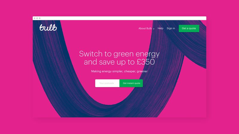
In the energy category, everyone was using traditionally trustworthy corporate colours. Inoffensive CMYK blue was big. So for Bulb, we set out to stand out. The bright RGB pink we chose was miles away from the rest of the category. But it also sent a strong signal. Digital, not analogue. Bright, not boring. This was an energy company daring to do things differently.

2. Be meaningful
Distinct is great. Meaningfully distinct is better.
Colours have meaning built up over centuries. Blue is trustworthy, orange is friendly, red is exciting, green is peaceful. But context is everything. Green takes on a different meaning for a brand associated with sustainability. Or for a brand that’s all about speed and opportunity, maybe green means go. For Careem, the UAE’s domestic alternative to Uber, green — a colour indelibly associated with national identity — meant local (The choice worked. When Uber bought them, they kept the brand).
For Bulb, pink was more than just disruptive. It was warm, progressive and human. It was meaningfully distinct.

3. Be single-minded
Multi-coloured brands look great in design presentations. They’re vibrant, exciting and flexible. But don’t be seduced. It’s hard enough to get someone to associate one colour with your brand, let alone a rainbow’s worth. Why make things more difficult? If you don’t know what colour your brand is, your audience won’t have a clue.
That doesn’t mean you can’t use secondary colours. But the word ‘secondary’ is key. Be disciplined. Maybe they’re there for functional reasons, like in the UI. In which case don’t use them on a billboard. Or maybe they’re there for a change of pace, or to make the brand feel less ‘corporate’. Sure, but don’t use them for your app tile. Define clear rules, make sure that everyone understands them and commits to enforcing them.
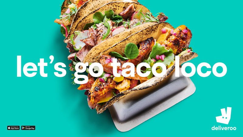
When Deliveroo launched their new identity, they ran a multi-coloured ad campaign. Every poster was a different colour. Red, green, orange, purple. You name it, they ran it. It would have looked great in the concept deck, but in the real world, it was a mess. They were sacrificing one of their most recognisable assets (and the only one they’d carried over from their previous identity), making it harder for their audience to join the dots. These days, every Deliveroo ad goes big on that distinctive turquoise. The same distinctive turquoise that’s on every rider’s jacket, every piece of packaging, every screen on their app and every other part of the brand experience.

4. Be functional
Branding is as much about scalability and usability as it is about anything else. So when you’re choosing colours, you need to know you’re going to be able to use them the way you need to. How do they work across different screens, materials, media? Achieving colour consistency is one of the hardest brand management challenges out there, and some colours are easier than others.
Make sure that the colours you’ve chosen work across RGB and CMYK (find out the difference between the two colour models here). Test them everywhere, and make sure you’re aware of the compromises. To find something more distinctive, some digital brands decide to sacrifice accurate reproduction in CMYK. On the flip side, brands doing lots of print might be influenced by whether there’s a paper stock that’s a close match — I’m sure the G.F.Smith Colorplan range of papers has driven a few choices. But whatever your focus, be clear where you’re happy to compromise, and where you’re not.
You’ll also need to think hard about accessibility. If you’re going to pick a bright poppy colour, you’ll probably run into contrast issues when using it with white type at smaller sizes. Make sure you have a plan to tackle that. And look at particular colour combinations too. The most common forms of colour blindness (deuteranomaly and protanomaly) result in a difficulty distinguishing between reds, greens and browns, so using these together isn’t a good idea. Google has a useful tool to help get this right.
5. Don’t leave it ‘til last
We’ve learnt our lessons from too many late nights before presentations spent frantically weighing up different colour options. Colour choice is too important to be left to the last minute. If you’re spending more time debating typefaces than your brand colour, you’re doing it wrong. It should be a strategic decision and it should come with a clear, logical rationale that goes beyond aesthetic preference.
If someone asks what colour your brand is, you need a good answer.


