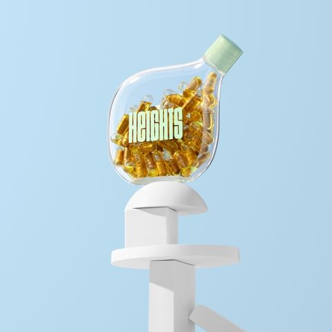
Using brand to get people thinking brain first
Max OttignonHeights are trying to change how we care for our brains. Max Ottignon explains how we used brand to help them change behaviour, while looking at a range of other Changemakers in the category.
This article originally appeared in Dieline.
19.01.20
Change began in Silicon Valley
The brain is the most important organ in the body. But in an era where healthy living is seen as a status symbol, we’re still more likely to care about our abs than our brains.
That’s starting to change. And like most major changes this century, it began in Silicon Valley. Founders started looking for ways to hack their brains as they would a line of code, trying to eke out every last bit of potential in search of an edge. The nootropics industry gathered momentum, with products breathlessly channelling the Limitless movie, promising instant ‘focus mode’, ‘smart mode’ or — when all else fails — ‘brain dust’.
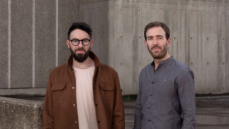
Entrepreneurs Dan Murray-Serter and Joel Freeman called bullshit. They wanted to re-educate the market with a brand built by experts (they’ve recruited a who’s who of cognitive science) and founded in substance. Enhanced cognitive performance comes from consistently feeding your brain the right food, getting enough sleep, and living the right lifestyle. And they’ve developed a service to help you get there: Heights is a cognitive performance subscription that combines a ‘smarter supplement’ with regular advice and inspiration.
But it’s not a quick fix. It takes time, effort and commitment. And that’s a tough sell for any brand. But like most problems, it’s easier to tackle when it’s broken down into key challenges.
1. Establish credibility
With any product in the health category, the first challenge is to get people to trust what you’re telling them. For Heights, that meant moving away from the ‘bro’ aesthetic of the nootropics category, borrowing less from physical performance brands in favour of something more thoughtful. Instead of angry reds and bold type, we used colours associated with the medical world, pairing them with calm, understated typography. And from a user experience, it was important to focus on measured facts, not wild over-claims. We built the design system to accommodate detail, using iconography and clear typographic hierarchy to enable the brand to deliver complex messages across every application, from the packaging through to the website.

2. Create aspiration
But too much science is off-putting. It won’t carry the emotional pull necessary to change behaviour. Once we’d convinced people, we needed to seduce them.
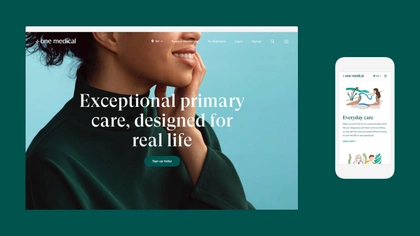
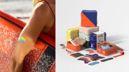
The health category has demonstrated a few ways to tackle this. Welly — Target’s first-aid brand — combines medical cues with a sense of naivety and fun, rebranding plasters as ‘bravery badges’. Who wouldn’t want one of those? One Medical borrows from luxury lifestyle brands to create an aspirational alternative to the functional primary care category. In each case, they retain some key cues — particularly ‘medical green’ — but play with the rest of their codes to create brands that draw people in.
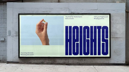
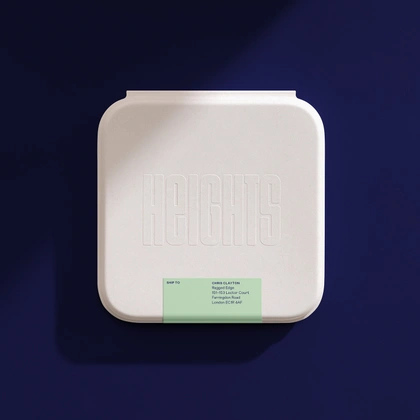
For Heights, we gave our health-inspired colours a pastel twist, positioning the brand as much in lifestyle as in health. Photography took a similar direction — less clinical, more desirable.
3. Get noticed
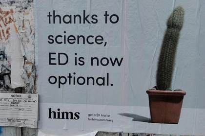
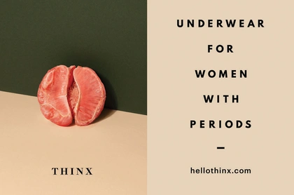
In crowded categories, you need to get noticed and get people to take action. Credibility and aspiration aren’t enough on their own. Brands like Hims and Thinx have been phenomenally successful by adding a layer of provocation, delivering in-your-face advertising that forces a conversation around taboos.
We tried to grab people’s attention in a different way. We started with a name that functioned as a call to action, pushing the audience to reach new Heights. And with a brain-like logotype designed to fill any space it was in - a visual invitation to stretch your brain. It can be used as a traditional logo to sit comfortably within the lifestyle aesthetic. But where additional stand-out is needed, particularly in comms, it can be used boldly at scale to dominate layouts, or as a background pattern. Variable logos need lots of care and attention in execution, but for Heights it meant we could keep the rest of the visual system incredibly simple and focussed, building equity into a single asset that could be used anywhere and everywhere.
Finally, we paired the visual identity with a tone of voice that was designed to feel outspoken yet witty. Headlines such as ‘Your future self will thank you’, ‘This won’t work unless you do’, and ‘You bring the brain. We bring the power’ aimed to get the reader to stop and think.
A question of balance
With these three principles in place, bringing the brand to life became a simple balancing act. Which one to dial up depended on where you were in the customer experience and the strategic imperatives of each element. Packaging could afford to focus on the aspiration, whilst comms would need a bolder approach, compelling people to act.
Great brands make complex, nuanced ideas feel clear and simple. But just like cognitive performance, it takes hard work and commitment to get there.

