Branding in the open
Branding is typically an opaque business. It happens behind closed doors. Finished logos pop up on Instagram and new identities arrive in carefully crafted case studies.
But branding has changed in the last six weeks. From the way we work to the way we present, our industry looks a little different these days.
Right now flexibility and transparency feels a lot better than smoke and mirrors.
Permission to speak freely
We’re currently working on an identity for a new startup from founder Ray Rafiq-Omar. Our creative team has been working over the last week or so to develop two concepts. And we literally presented our first round creative to him a couple of days ago.
We have our opinions on the way forward. But first, we thought it’d be fun to hear from you. The creative community, other founders, our other clients, anyone. Tell us what you think, and which route we should progress with?
We can take it. We’re ready for the ‘my four-year-old could have done that’ comments. But we hope this transparency and participation will show that branding is about much more than a logo. It’s a collaborative process, and no projects come out fully developed in the first round. And great work, takes a brave client.
The brief in brief
Before you review the work, you should probably have some context.
Buying and selling homes is complicated and costly. Ray founded Free to be the very opposite. Free lets you list your house for sale on Rightmove in five minutes, for free. Free is for a homeowner who believes they are the best person to sell their home. The person who knows the house, area, and value better than anyone. And who doesn’t want to deal with estate agents and pay unnecessary fees.
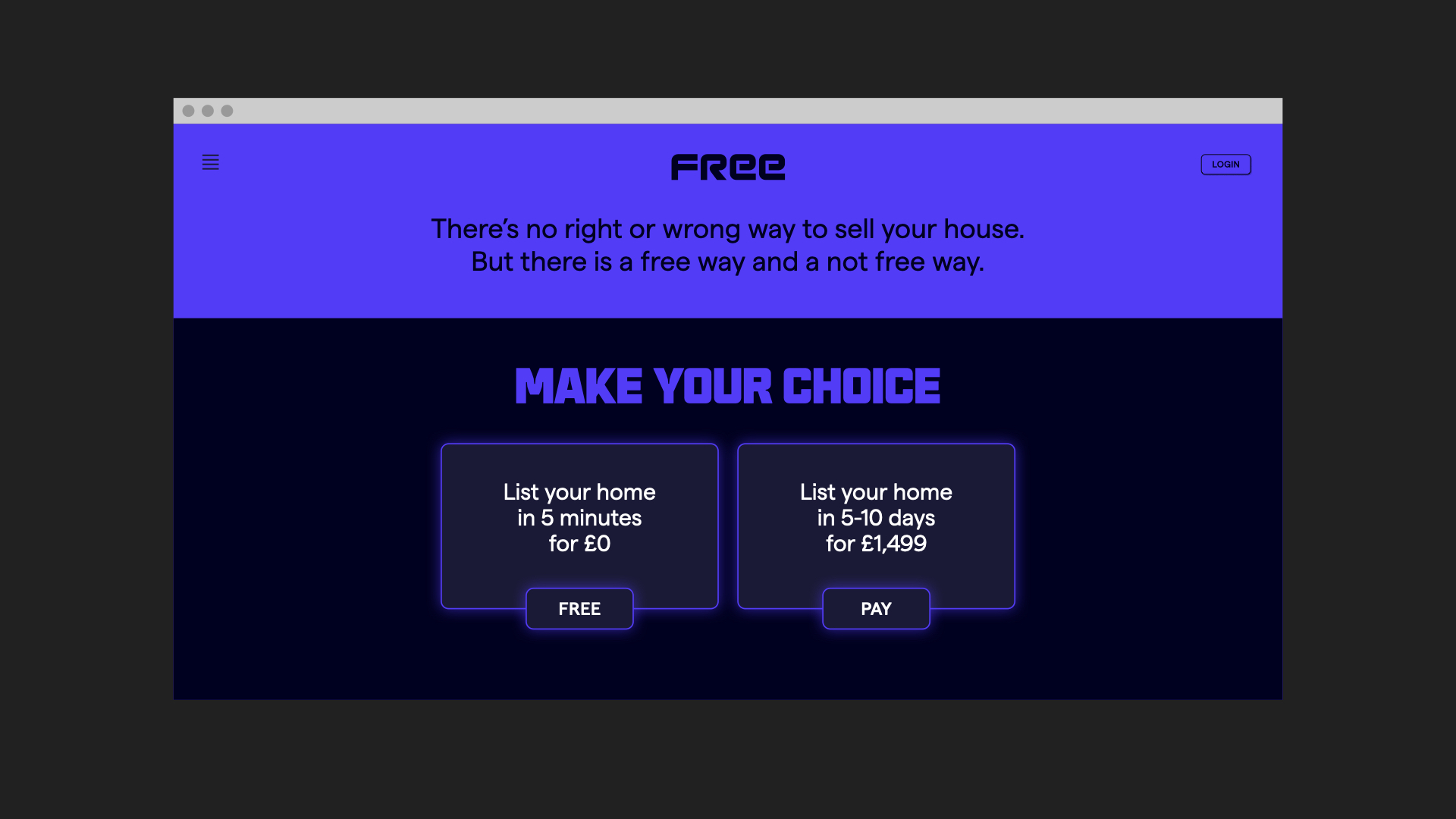
Free’s closest competitor would be Purple Bricks. Who take 5–10 days to get a listing on Rightmove and charge £1,499.
We had two meetings prior to starting work. One for Ray to introduce the product. And one where we showed him a whole bunch of creative stimulus and asked some probing questions to understand the audience as well as his appetite for this identity. It’s part of our regular process that we now recreate on Zoom.
We talked about Marvel, Karate Kid, GeoCities, Mac vs PC, Ugly Drinks, Revolut and a whole lot more. We’ve paraphrased some of what we heard in those sessions, which should nicely set up each route, and what we were trying to achieve.
Oh, and we should probably mention Ray’s ‘brief in one word’: Dystopian.
“Complexity doesn’t need to exist. This brand is practical. You shouldn’t need to work it out. It’ll make you question why everything isn’t as simple.”
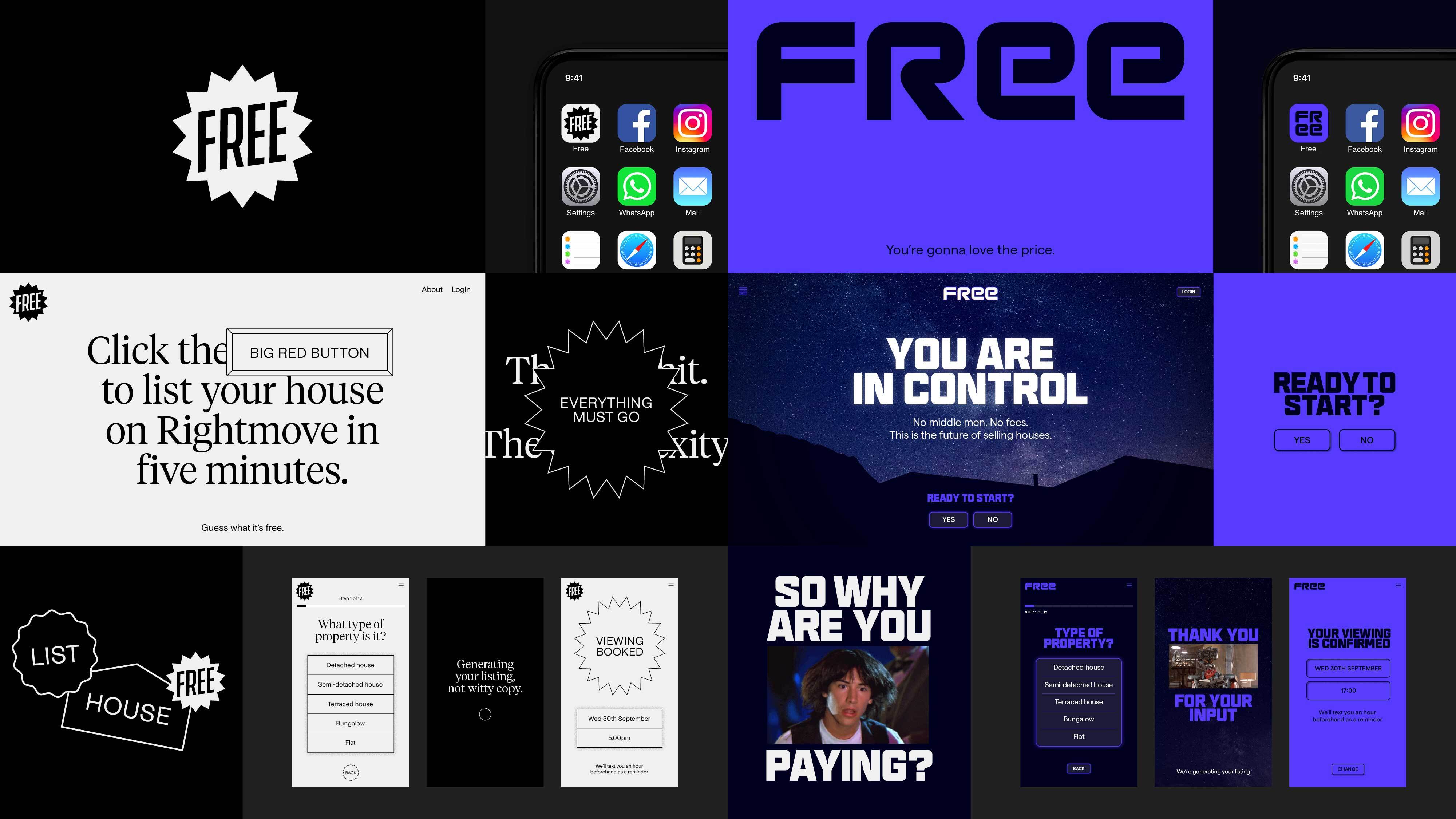
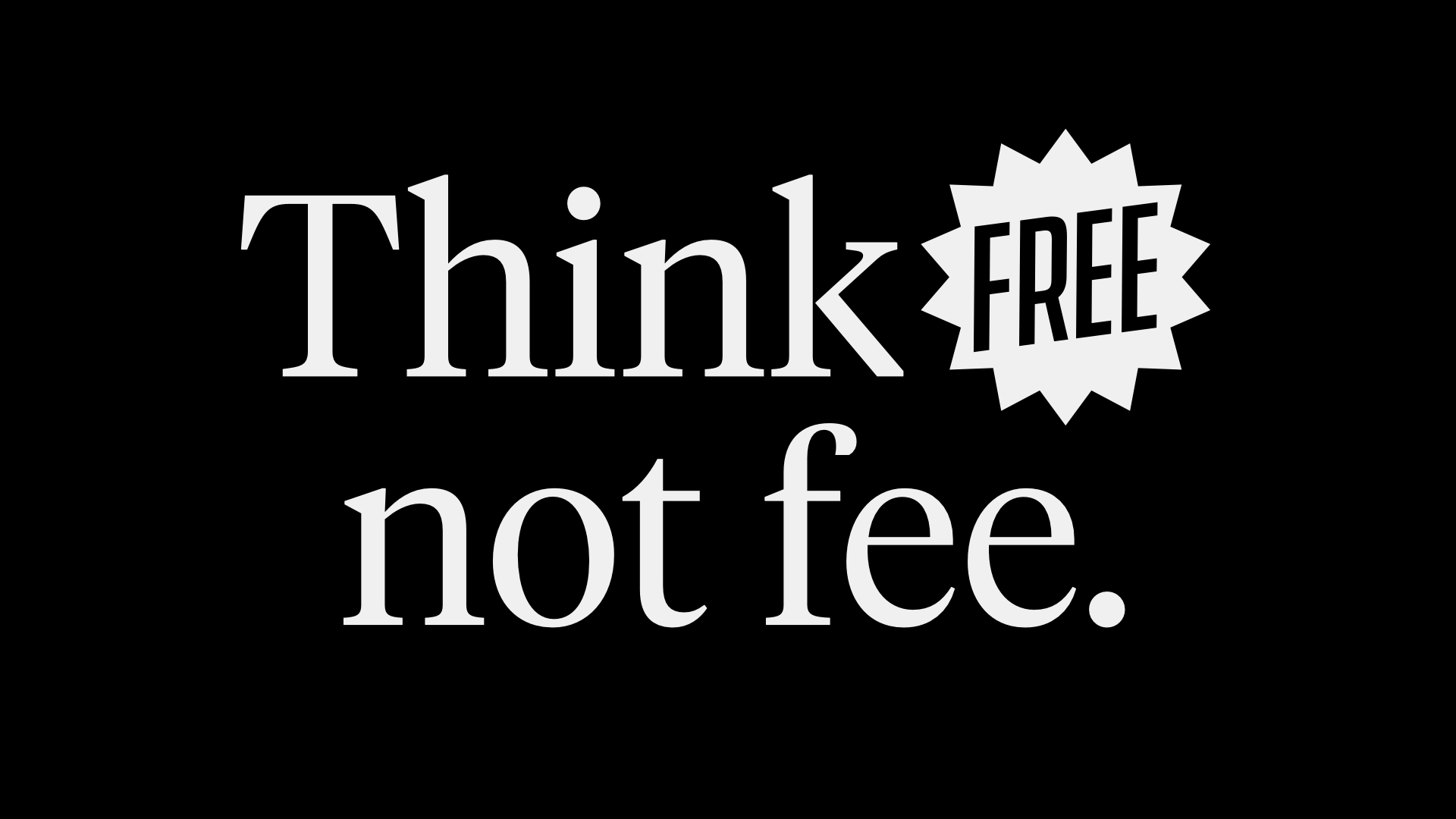
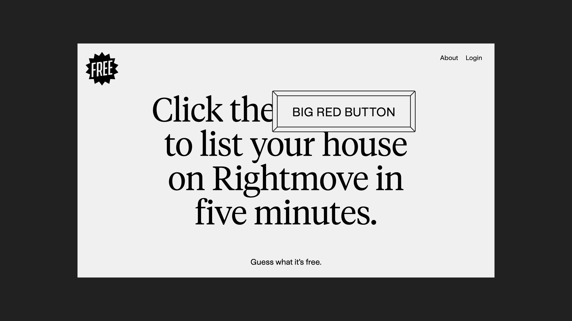
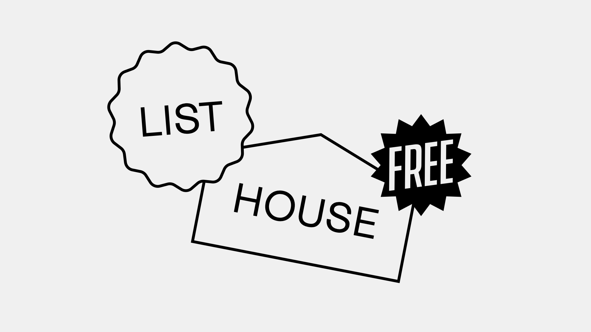
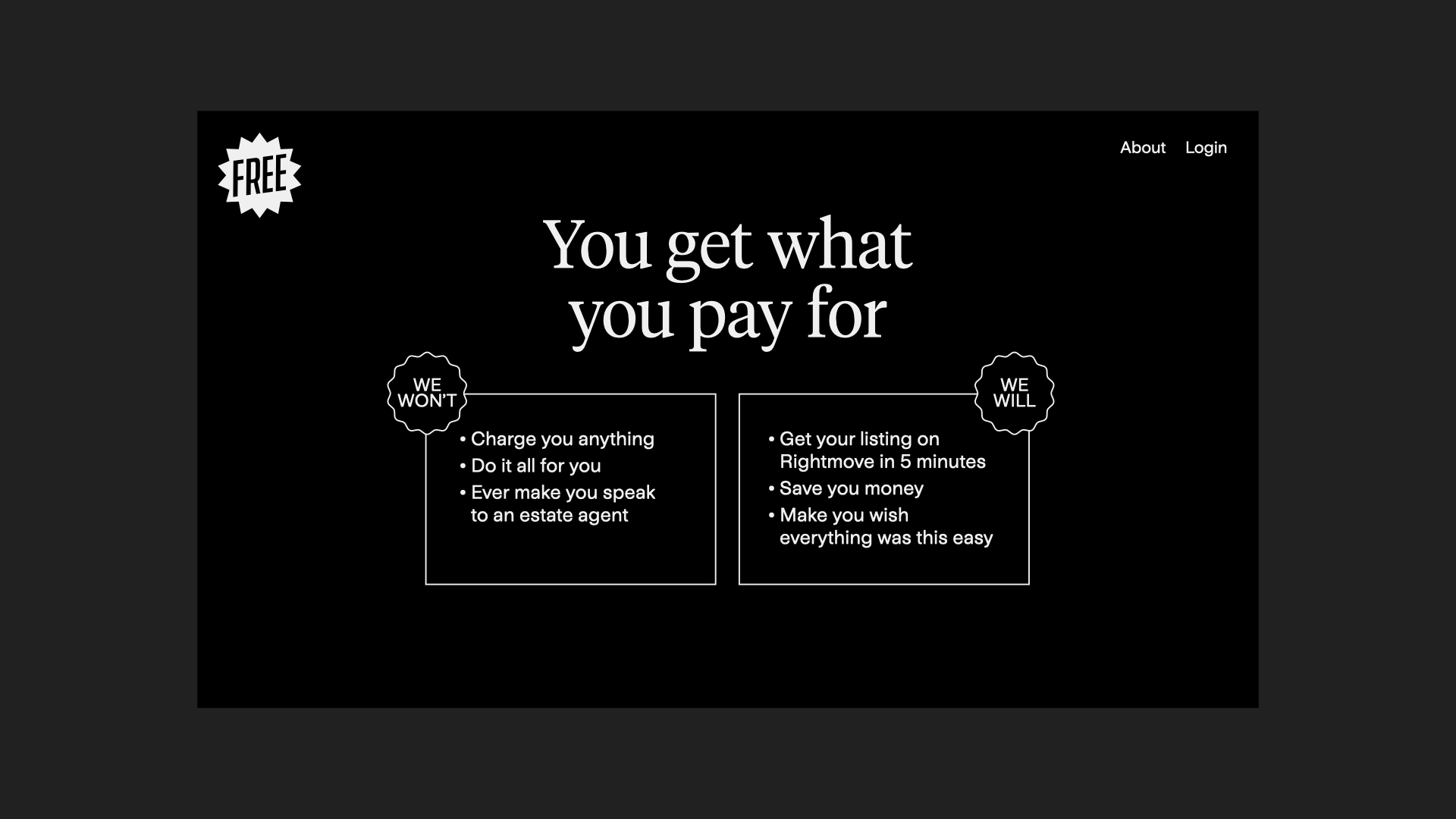
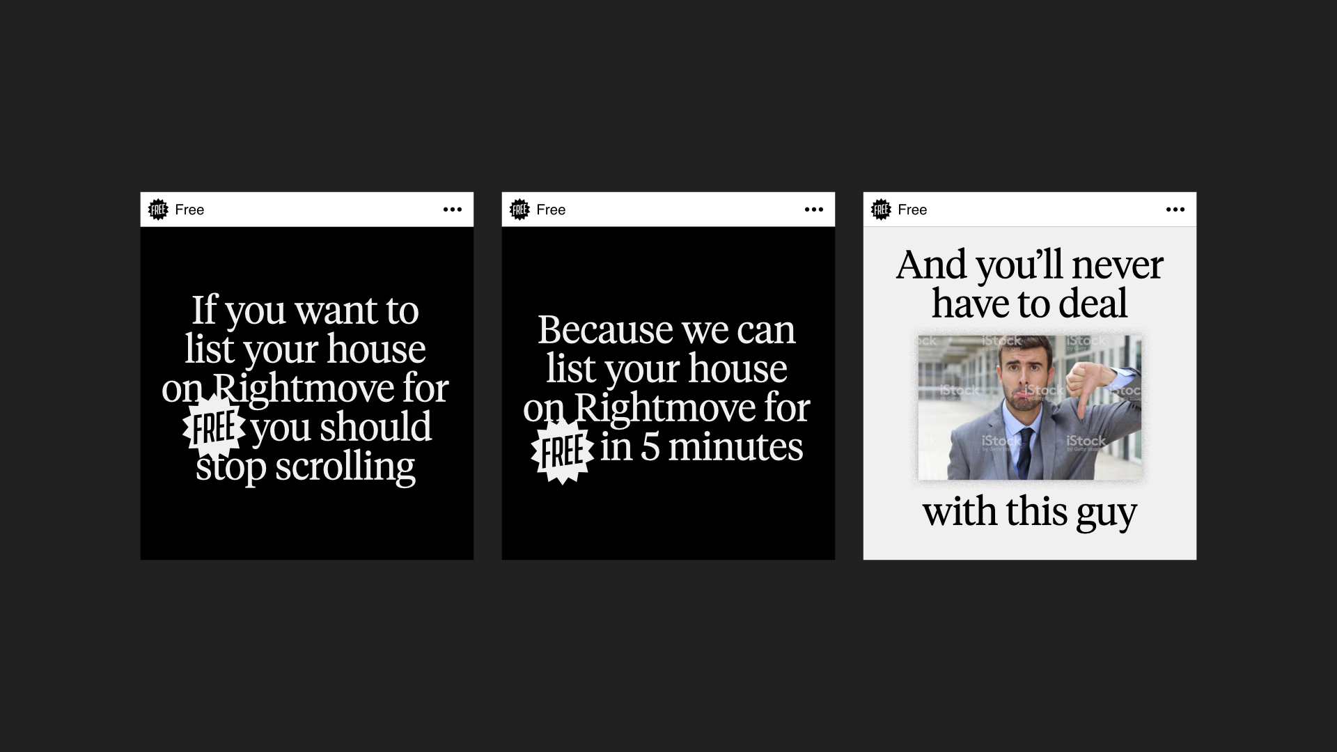
For this route we borrowed the visual and verbal language of “sale”. Just as the brand does away with unnecessary fees and complexities of selling a house, we sought to reflect this in its identity. Everything must go.
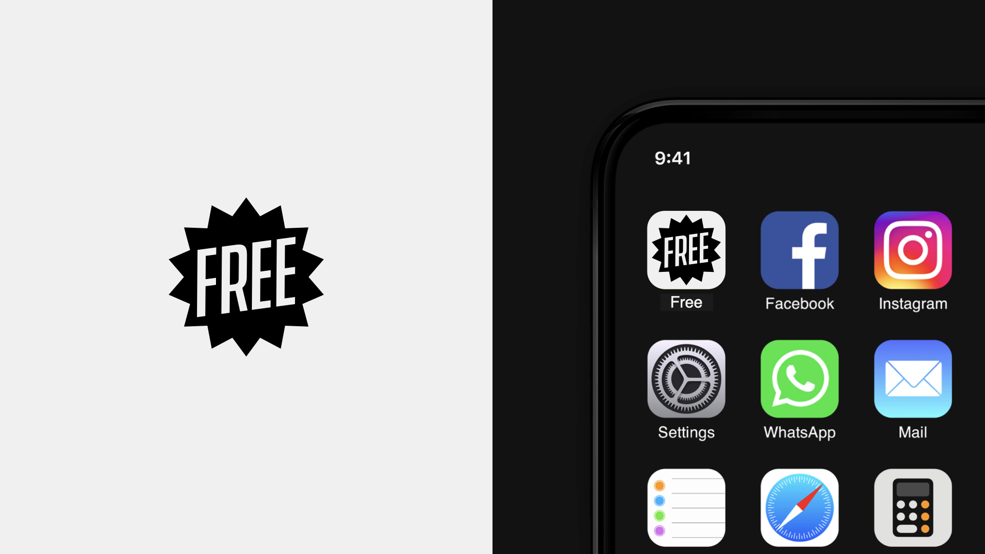
That classic price flash becomes a nicely contained logo. Great for an app tile or social media avatar. That directness of message pushes clarity to its extremes and creates a slightly offbeat, deadpan tone of voice.
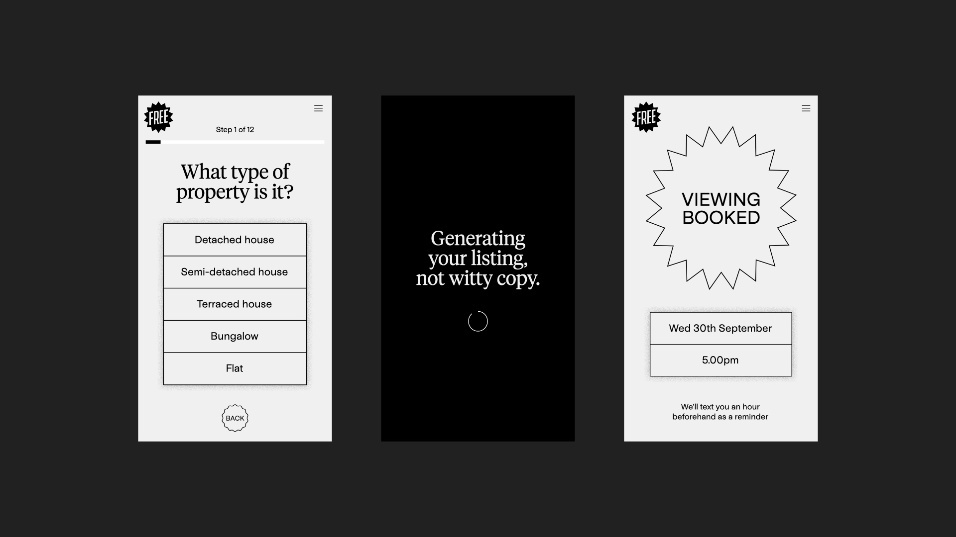
Then we stripped everything else back. That means a black and white palette, a nothing fancy typeface, and a user interface that could be wireframes. Just the essential information and design.
Together, these core elements have a certain sophistication, and yet couldn’t be simpler. Hopefully it feels like anyone could’ve done this, which should speak to the DIY mindset of our target audience.
Route 2
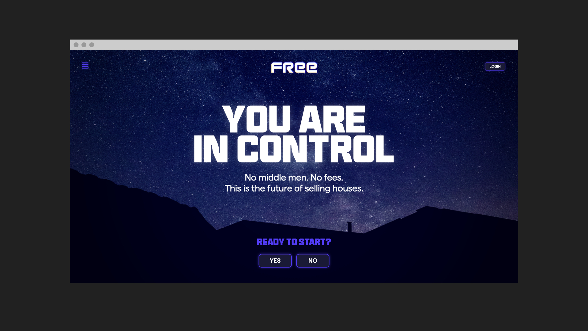
“This brand needs to be powerful, rebellious, futuristic – but the 80s vision of the future. It should stand out. Make you sit up and think woah.”
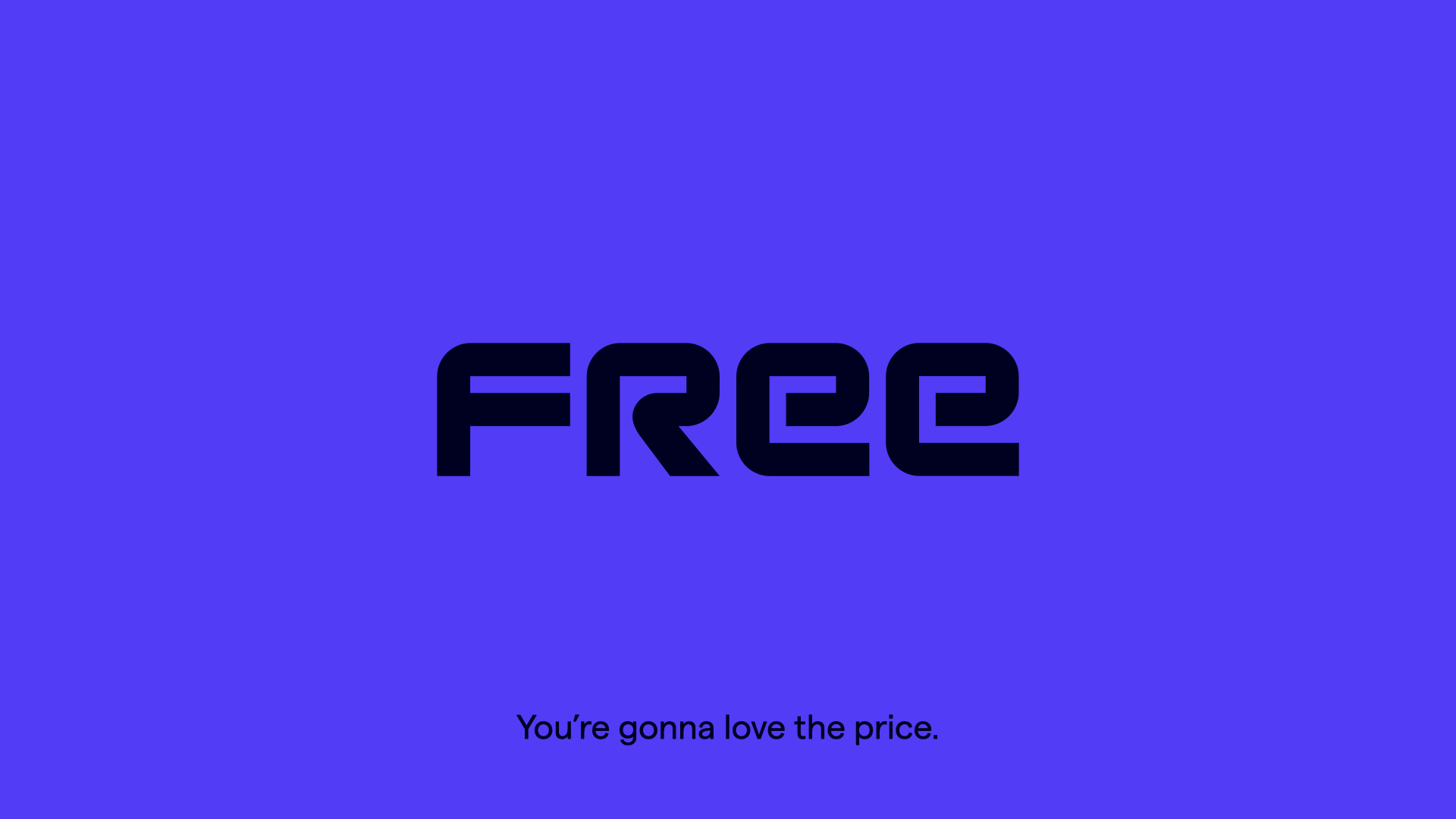
For the future of selling houses, we set out to evoke an 80s vision of the future. We really wanted to push against the traditional tech start-up aesthetic.
The result is a crisp, modern take on that inspiration. Because this identity has to be both evocative and functional.
The logotype feels 80s and sci-fi, yet new and geometric. The typeface is modern, but wouldn’t look out of place on a VHS cover. We always wanted that tension in the design elements.
And then there’s a fun, rebellious spirit that should come through too. In copy, Free is unafraid to acknowledge industry conventions, even the alternative options a homeowner has. And if the ultimate enemy is Purple Bricks, wouldn’t it be even more rebellious to tread on their toes a little colour-wise?
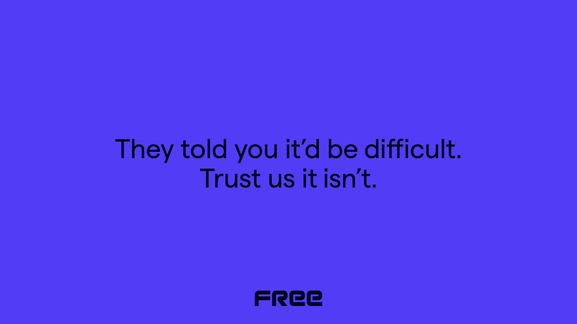
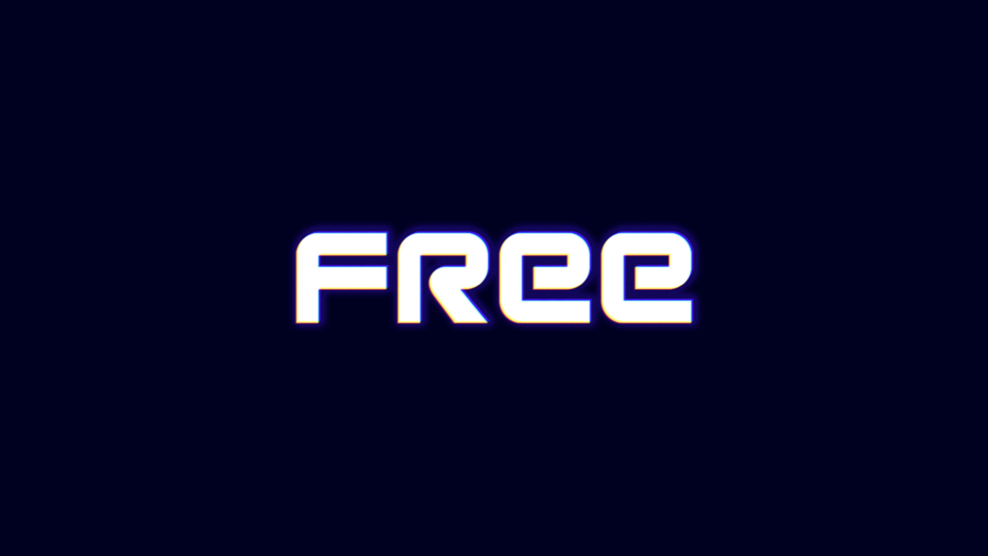
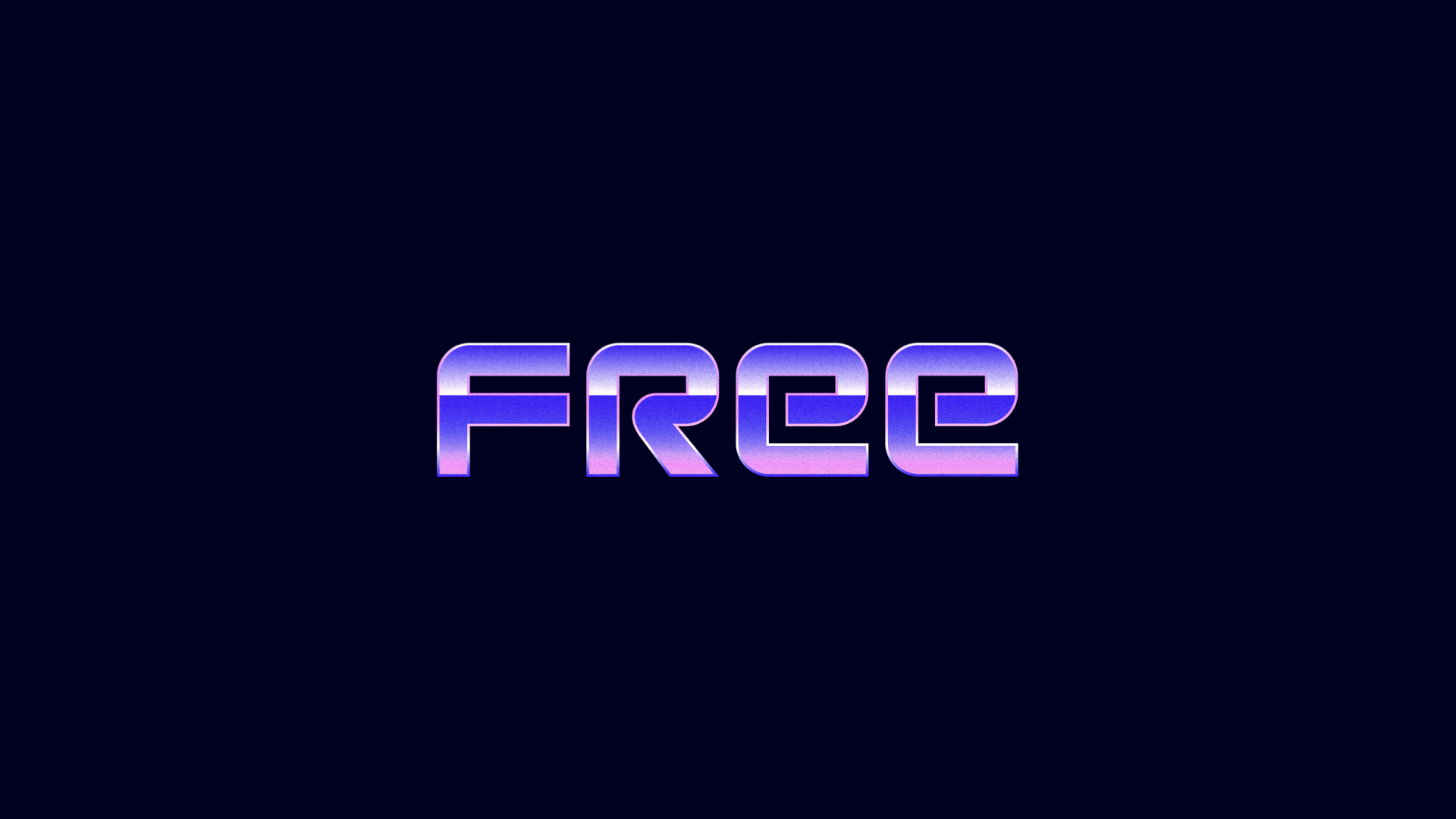
So there you have it. The brief, some context, and our two identity concepts. Which route would you pick to progress?
Head over to our Instagram and like or comment on your preferred direction.
