Wise
Wise committed to the world’s money. With a rebrand rolled out in 175 countries.
Wise was founded in 2011 to make sending money easy, fast and cheap. A game-changing product that achieved game-changing growth. In 2022, 17 million customers used Wise to move $150 billion.
Our ongoing partnership started with a transformational rebrand. To help them stand out from an endless stream of imitators. And take them beyond money transfers. Empowering people and businesses to use money everywhere. This is the world’s money.
Overview
The partnership
A global rebrand aimed at both consumers and businesses. And an ongoing collaboration with the Wise team across all parts of the brand.
Define
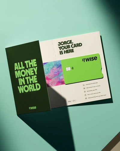
The brand strategy simplifies and amplifies what makes Wise different. They’re not building a better bank. They’re building a new money system to replace the old one. For individuals and business. Accounts with $100 or $100 million. Based anywhere from Chile to China. A brand for the world's money.
The idea
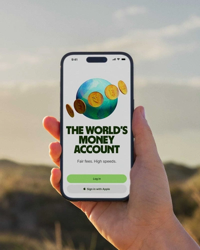
The World’s Money is for everyone, everywhere. Direct, distinctive, and truly global.
Create
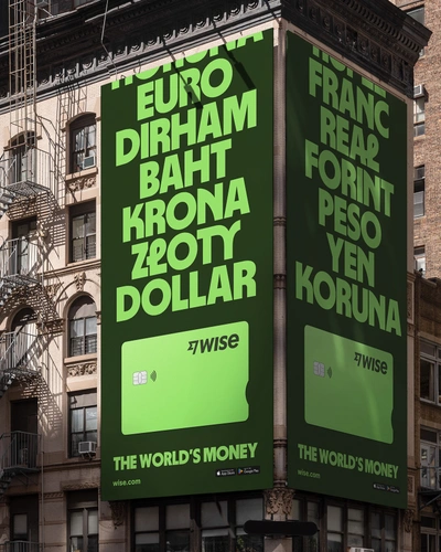
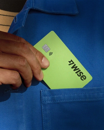
The World’s Money is expressed throughout every part of the identity. From the vibrant green — a symbol of both money and progress — to the type, a set of graphic tapestries, and a verbal identity with global currency.
Logo
Redrawn to retain the equity in the fast flag, now built for scalability.
Bespoke typeface
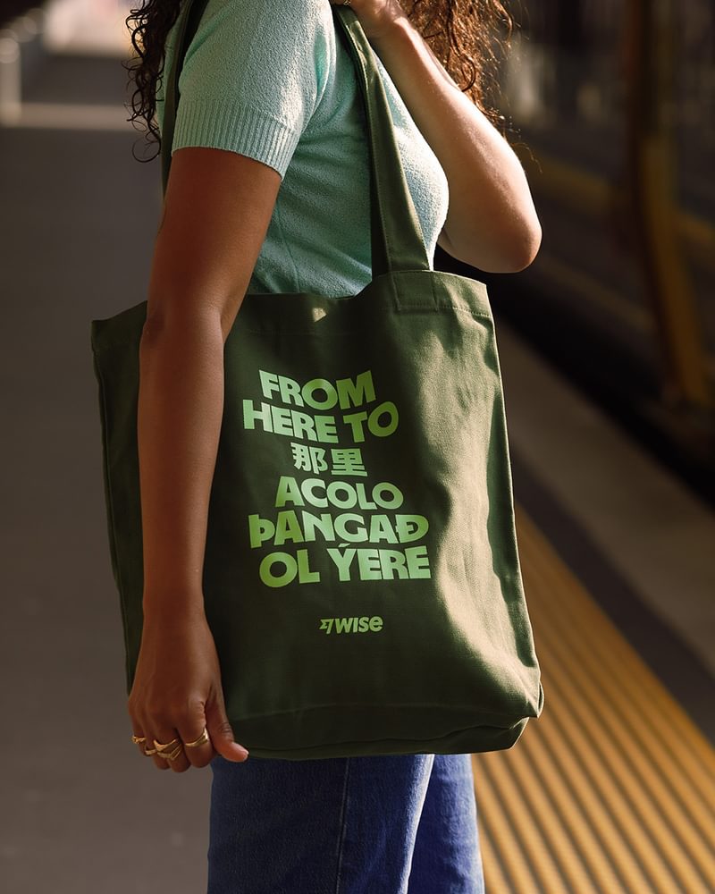
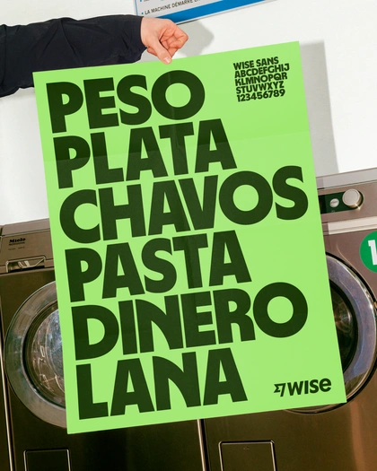
Inspired by scripts from all over the world, Wise Sans is instantly distinctive. And truly global, with support for 960 languages.

Verbal identity
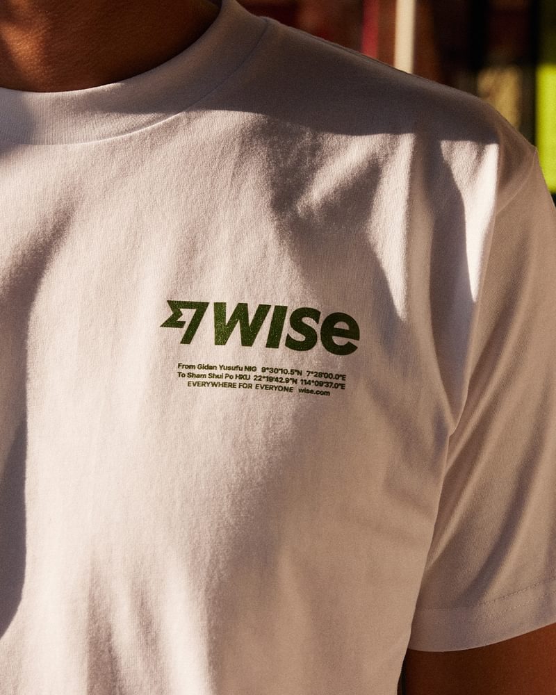
How do you create a verbal identity that works in 175 countries? Copy and messaging is direct and to the point, just like the Wise product.
Tapestries
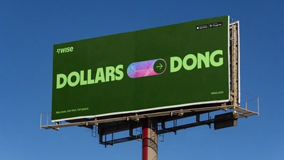
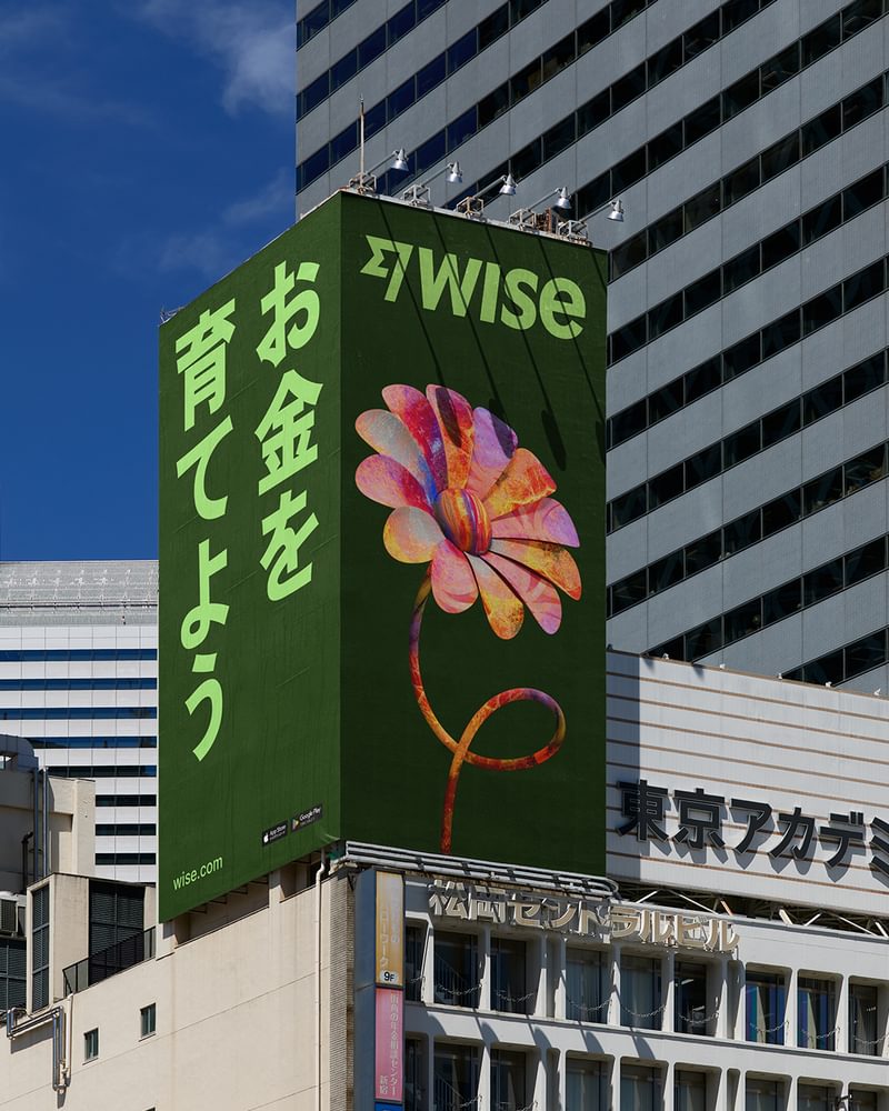
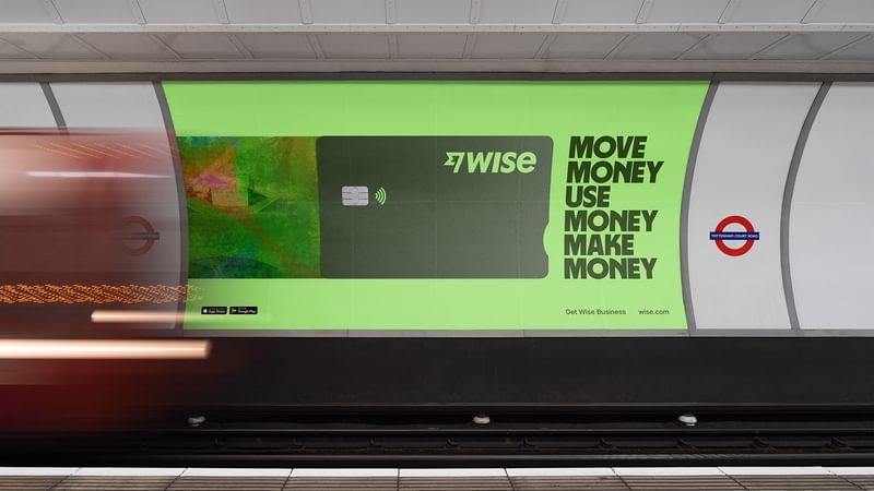
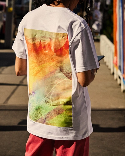
A set of graphic assets inspired by the world’s money. Immediately recognisable and endlessly flexible.

Wise Platform sub-brand
Wise Platform allows banks and large enterprises to tap into Wise’s technology to deliver capabilities they can’t emulate themselves. A new sub-brand aimed at the C-Suite of big financial institutions frames Wise Platform as an invisible payments partner. It’s Wise, but built for the boardroom.
When I saw the design work come to life for the first time at Wise Connect in London last year, it blew me away. It’s grabbed attention across this part of the industry and helps give us a runway to succeed in our mission.
Commit
Our partnership with the Wise design team is seamless. Allowing us to co-create for every touchpoint, from button to billboard.
Product design
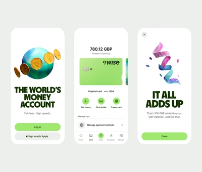
We worked with the Wise product design team to create a scalable system that lives across every part of the digital product. Globally accessible and exceeding WCAG 3.0 requirements.

Film and photography
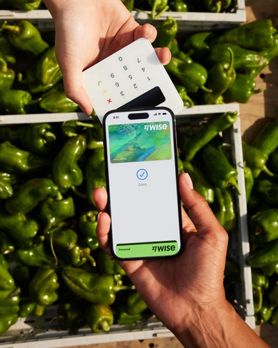
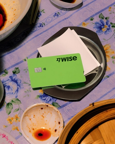
Our ongoing partnership includes the creation of a constantly evolving library of still and moving image content. Showcasing people using money here, there and everywhere.
The different reality
The rebrand launched in 175 countries, all at once. Website conversions went up 10% while people started using the product differently, with a 34% uplift in new users embracing the account functionality. Over the following 12 months, the Wise share price increased 58%.
Our partnership continues to develop and is now in its fourth year. Meanwhile Wise’s valuation has increased to around $14.4 billion at the time of writing, almost double its valuation before the rebrand launched.
A world-class team
Together, we reshaped the traditional client-agency relationship. Maximising our strengths and embracing each other's skills in a seamless partnership.
Ragged Edge have been a fantastic partner to work with. They took the time to get to know Wise, our customers and our vision. This shows in the work as it’s confident, unique and drives change for our business. Thank you Ragged Edge. Together we’ve changed the world’s money. PS they’re also great humans.
Over the past 18 months, Ragged Edge have been critical partners to us in every sense of the word. The collaboration between Wise and Ragged Edge’s teams was deeply practiced at every level, from opening up their Figma files to us along the way, to us inviting them in to advise on the direction of our business. Their influence on the future of this brand will be felt for years to come.
Industry recognition for the Wise rebrand
Fast Company
Innovation by design awards
Best Branding project
Honourable mention
Design Week Awards
Writing for design
New voice
Winner
Design Week Awards
Identity design
Rebrand
Highly Commended
Design Week Awards
Digital design
App design
Highly Commended
Design Week Awards
Best internal design team
Highly Commended
D&AD Awards
Branding
Design Systems
Shortlist
Art Directors Club
103rd Annual Awards
Branding
Merit
Brand New
Review of 2023
The Best
Winner