Our approach
We cut through the noise with a ‘Straight Up’ health brand that tells it like it is.
D2C Health Food Brand
In a health and wellness market crowded by ‘miracle cures’ and unrealistic diet plans, Batch Organics is a breath of fresh air.Its frank, truth-telling approach cuts through the fanfare. So we created a no hype, no hassle health food brand for busy people who want to eat well.
WE PARTNERED ON
Brand strategy, naming, visual and verbal identity, digital design, photography and packaging.
CHARLES OWEN
CEO, Batch Organics

Our approach
We cut through the noise with a ‘Straight Up’ health brand that tells it like it is.
Our brief
Most health food brands oscillate from fuzzy and over-sentimental to cold and utilitarian – focused on ‘gains’ and nutritional science. Batch Organics (originally called Natural Blender) wanted to cut across the commotion, with a striking ‘nothing but the truth’ message. We reimagined them as the fuss-free option for people who want to get on with eating healthily. No faff. No fads. Just great ingredients delivered to your door.
Brand strategy
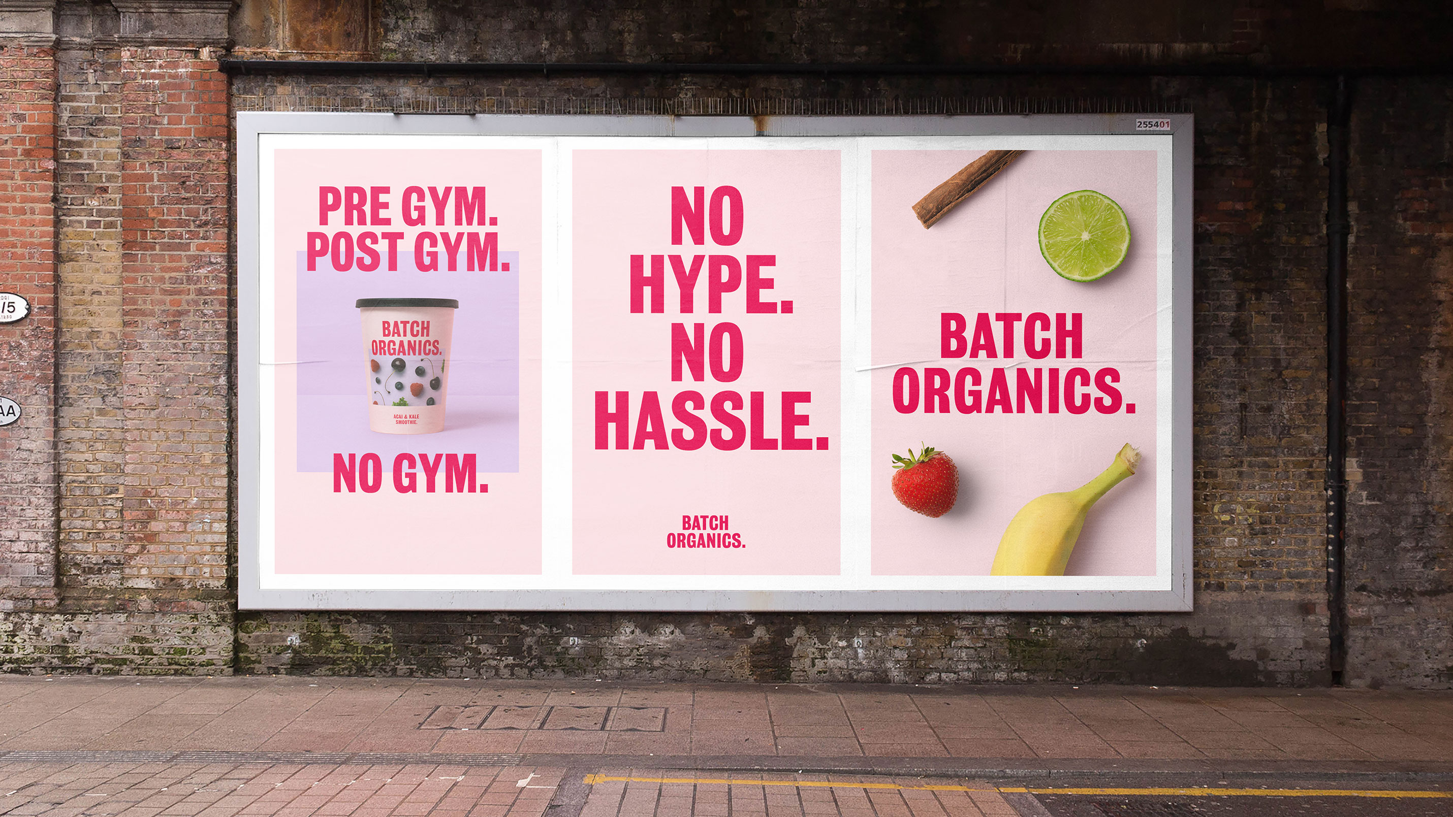
Market research revealed Batch Organics’ audience are already engaged in healthy eating. They know what’s good for them, they just need quicker, easier ways of maintaining healthy lifestyles. So we created a new proposition: ‘Straight Up’. No nonsense good food, free from marketing fluff, for people on the go.

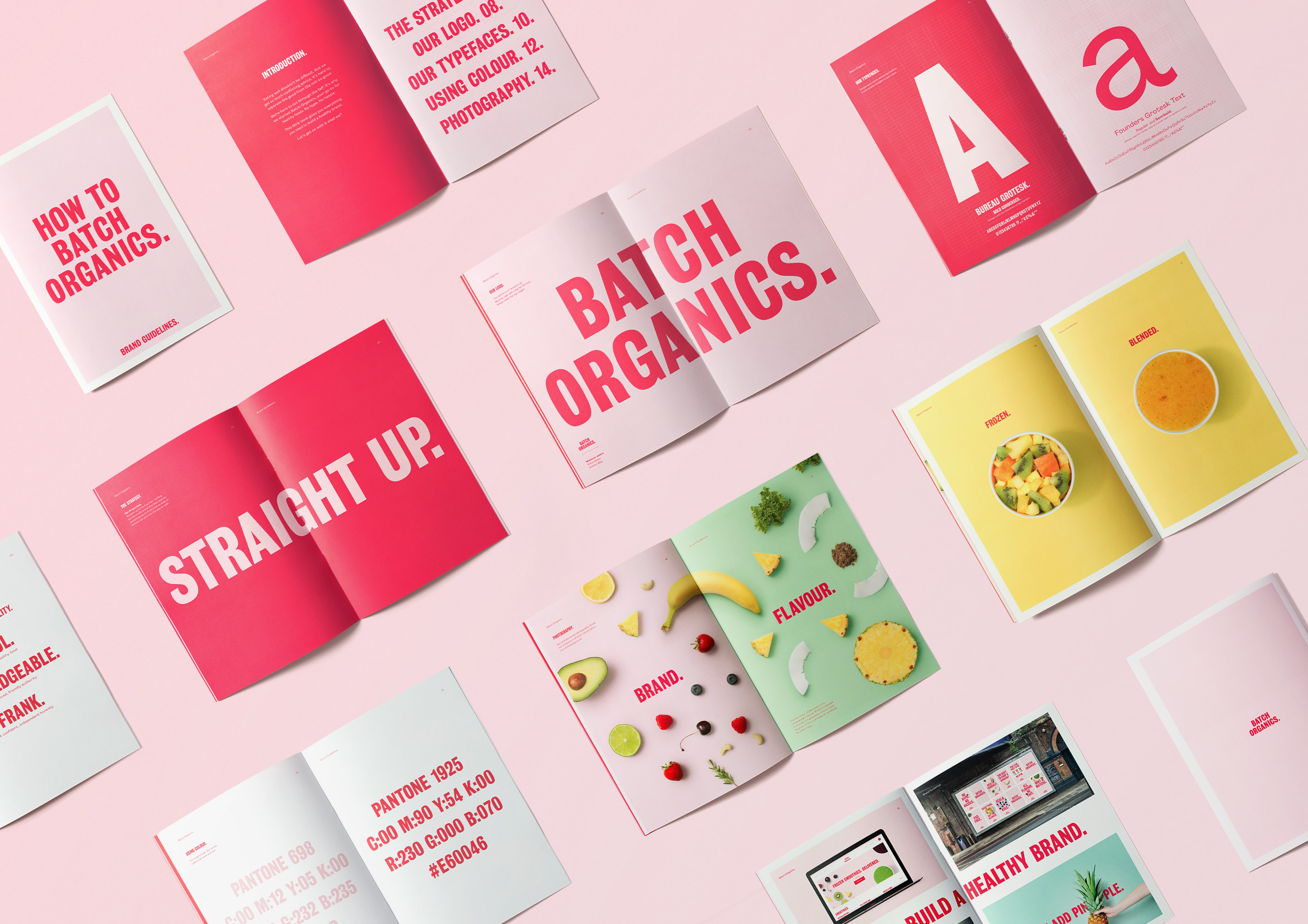
Naming & visual identity
We created a brand name to reflect the new direction. Natural Blender became Batch Organics, a no frills moniker that heroes the product’s organic goodness.
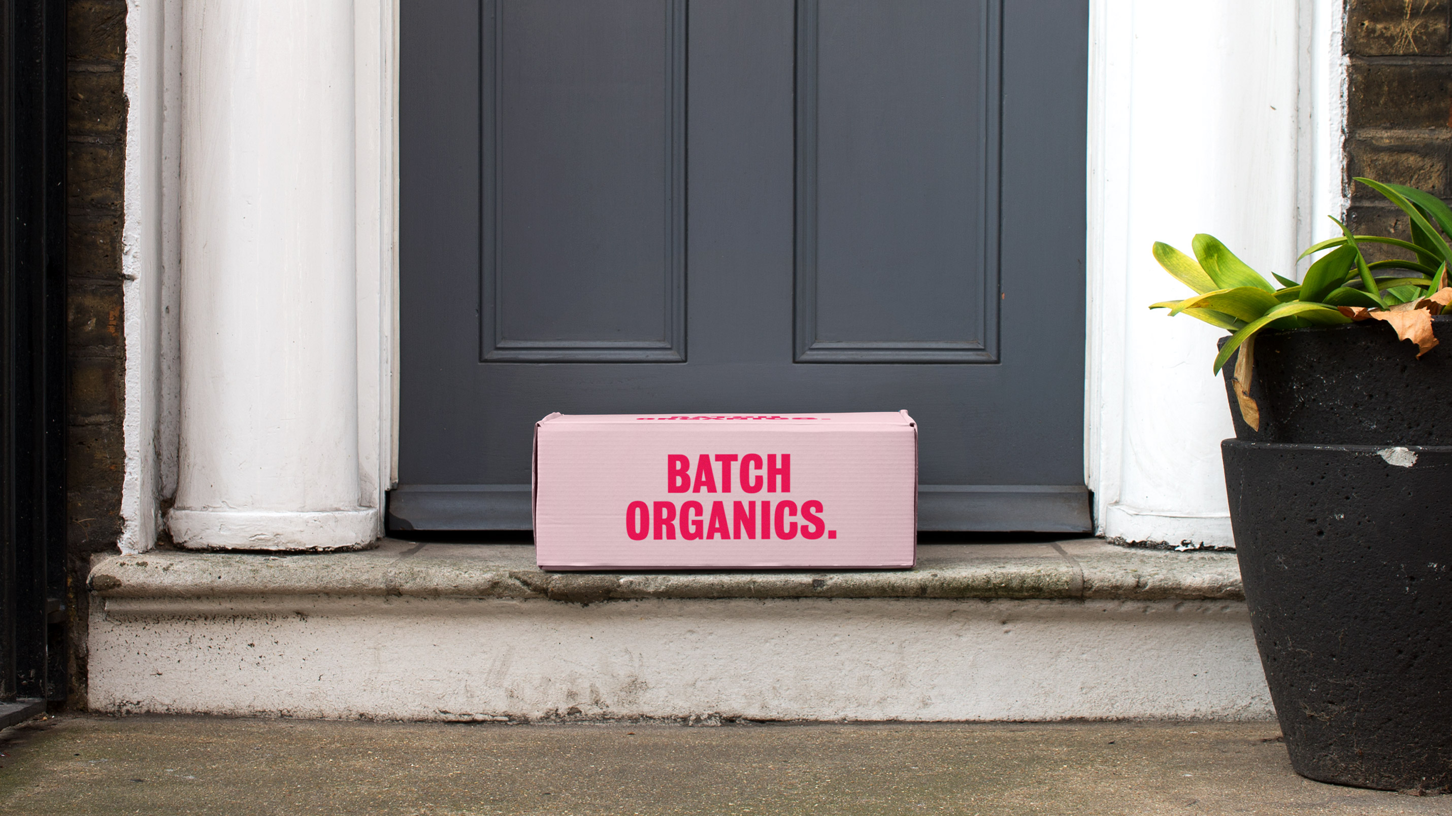
Visually, we steered clear of the handwritten type and fiddly logo conventions of the category. A bold, clean brand typography and wordmark create a fresh look that is unmistakably Batch Organics. Although the font is functional in style, the soft, inward curls of the ‘G’, ‘C’ and ‘S’, add a touch of personality.
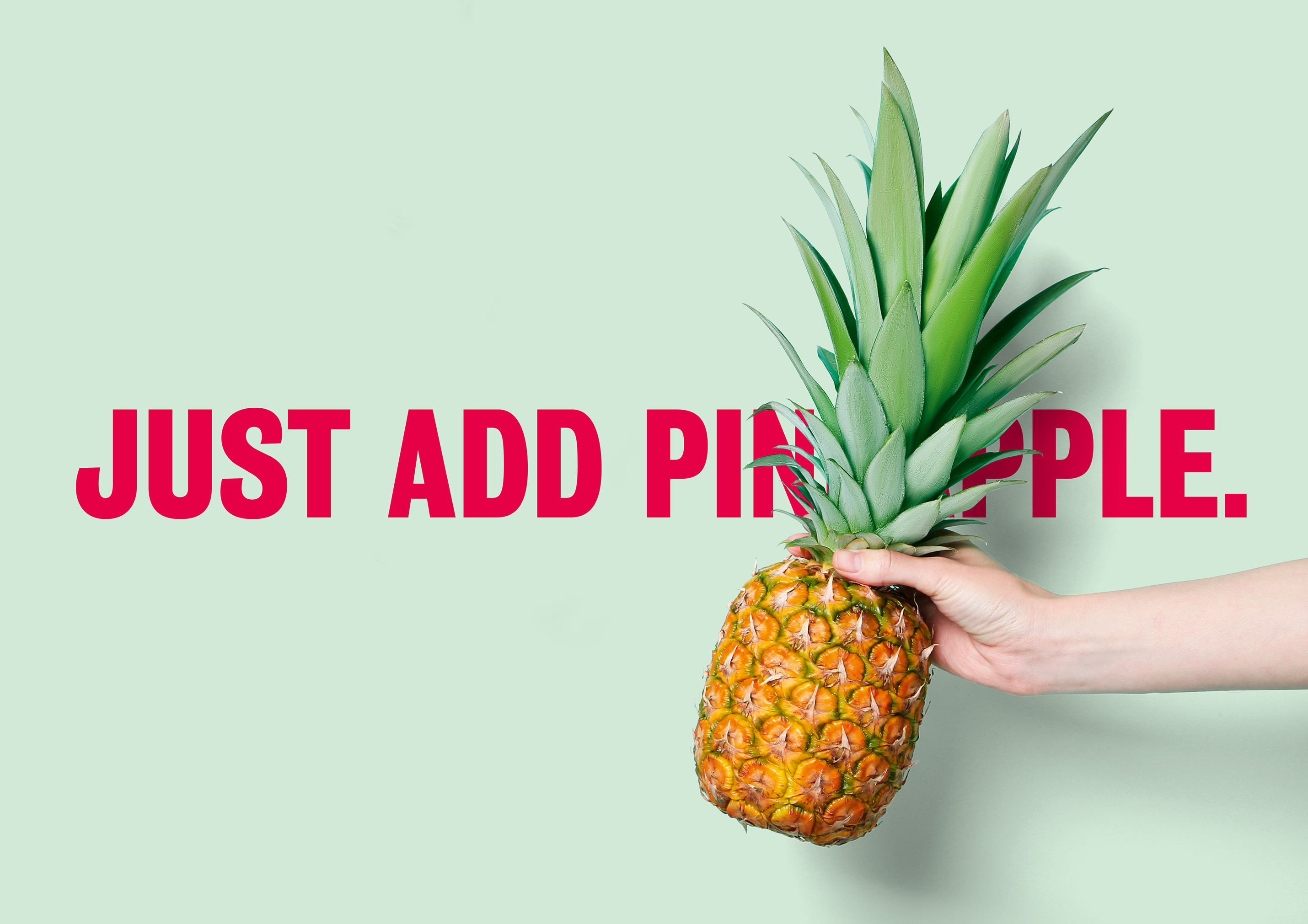
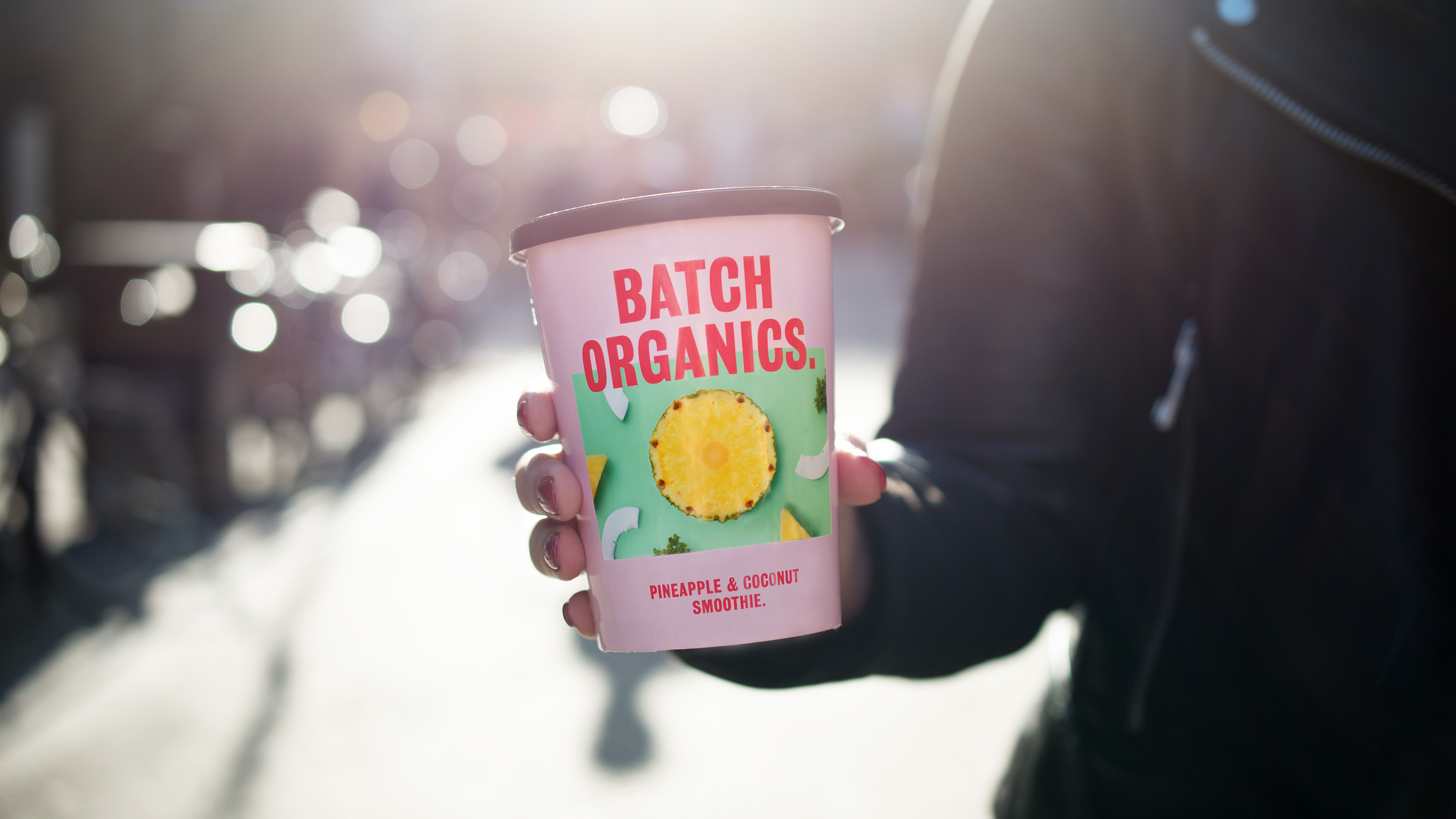
Food brands often package products in different colours for different flavours. To make it stand out, we gave Batch Organics a single colour it could own across a range of products. We complemented this stripped back colour palette with food photography centering delicious smoothie ingredients.
Verbally, an assertive tone of voice helped bring the new brand attitude to life. Pithy, straight-talking headlines communicate a frank, fuss-free ethos.
HAROLD
Head of Marketing, Batch Organics
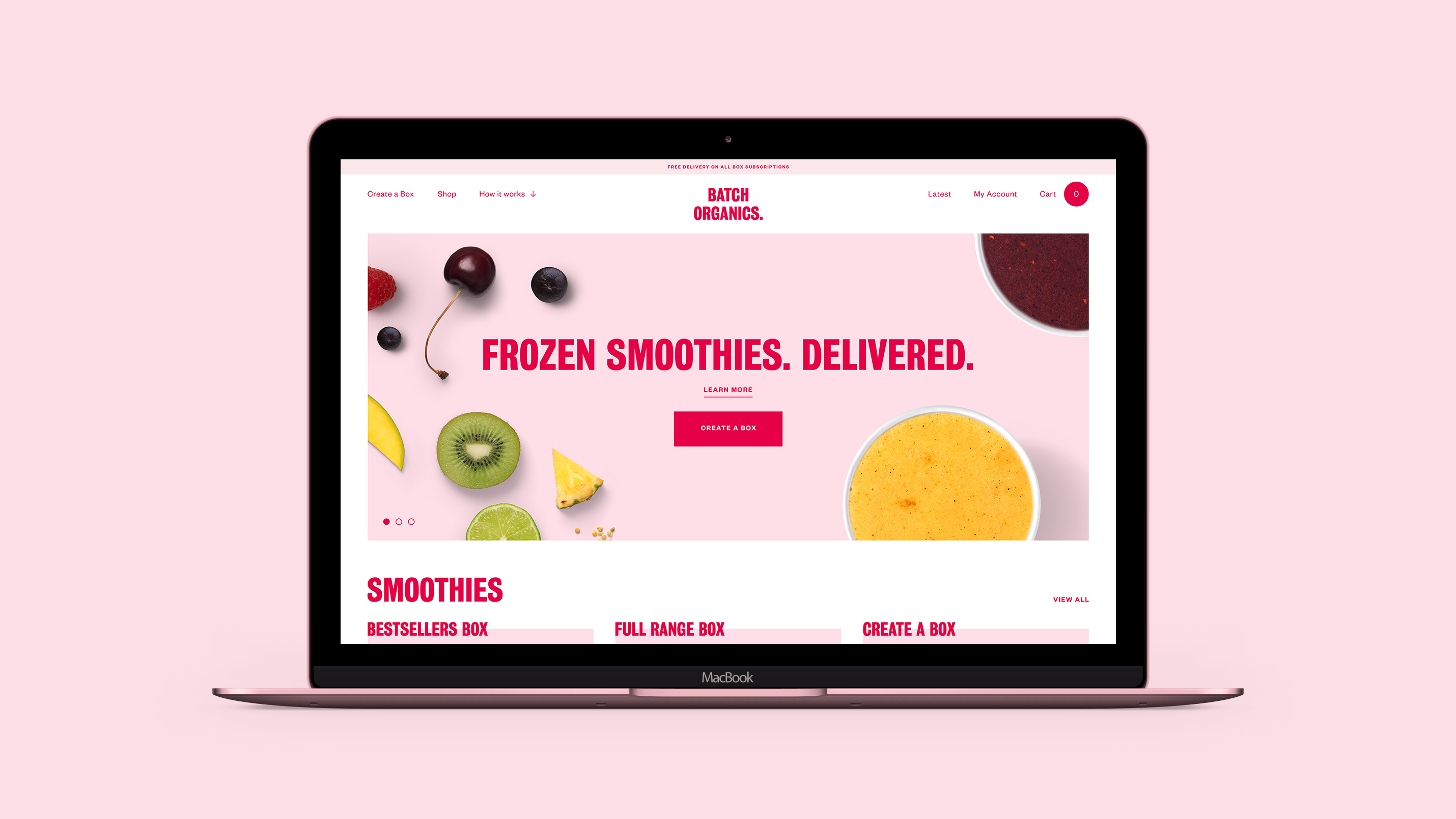
Guidelines & implementation
The brand was brought to life with a new website and improved user experience journeys. We also redesigned Batch Organic’s packaging in line with the new visual identity. This included a new collection of smoothie cups, breakfast bowls and milk cartons.