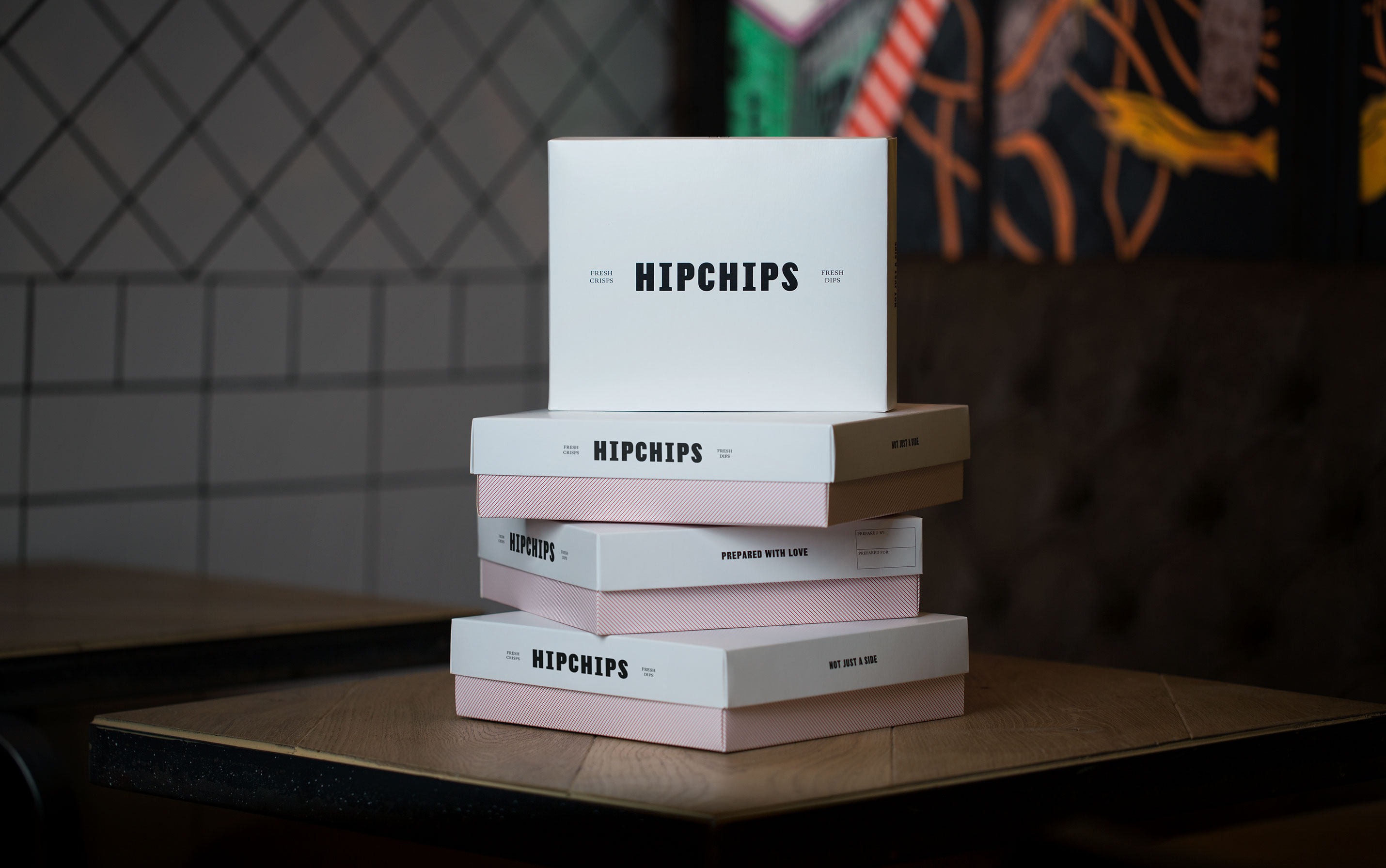
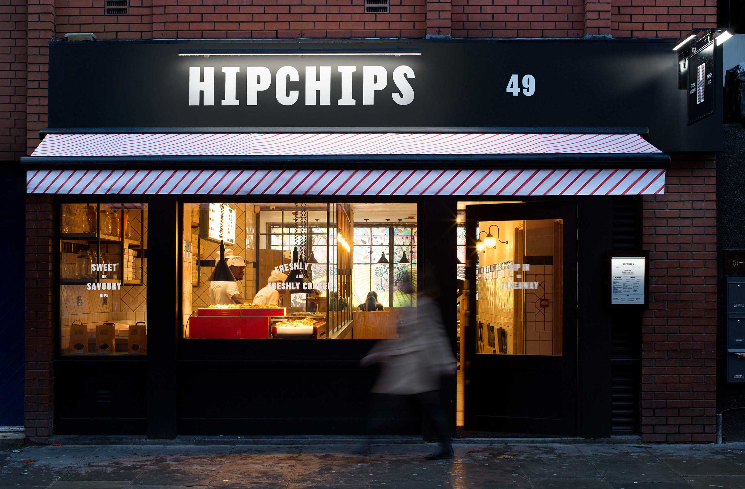
WE PARTNERED ON
Brand positioning & strategy, visual & verbal identity, interiors consultation.

Our brief

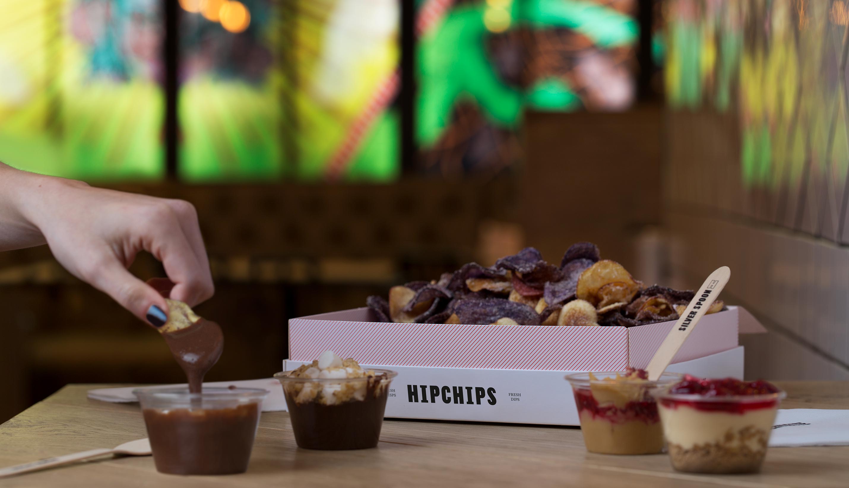
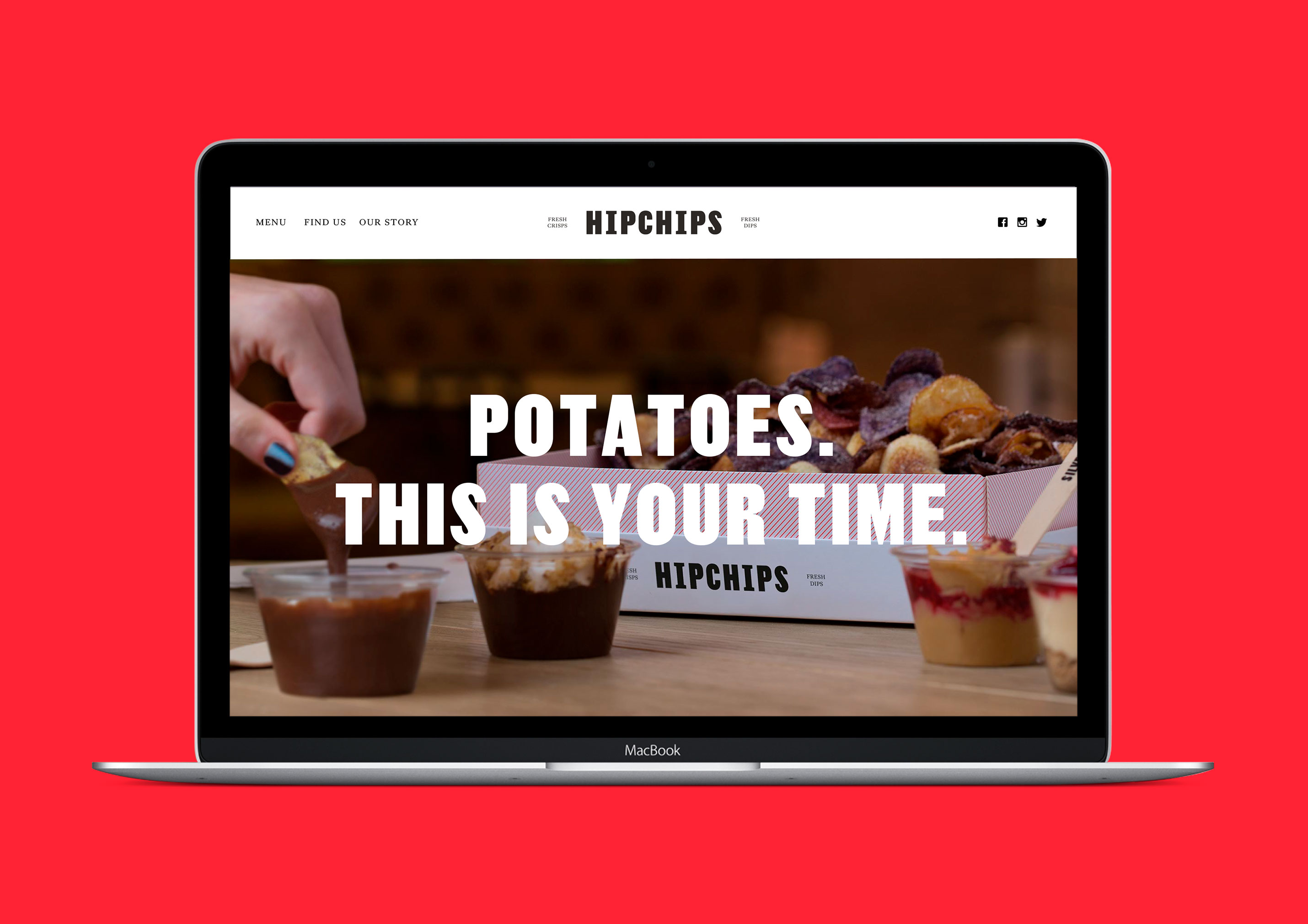
Hipchips is the first of its kind: a crisp restaurant in London’s Soho. It cooks crisps on site using heritage potato varieties and pairs them with experimental dips, both savoury and sweet. We created a brand to get it noticed as the latest disruptor in the capital’s ultra-competitive food scene.

Strategy

Crisps don’t get the respect they deserve as Britain’s most popular snack. A predictable staple, they’re never the star of the show. By reinventing them as a shared foodie experience, there was an opportunity to engage a huge audience hungry for Instagram-worthy rituals. Fresh crisps. Fresh dips. Fresh traditions.

Visual & verbal identity

We took a set of British staples and reimagined them for a new audience. A traditional red, combined with a very modern set of supporting colours. A set of pinstripes given a 45 degree twist. Two classic British typefaces – Thorowgood Sans and Kings Caslon – set in contemporary ways. And a tone of voice that’s unmistakably British, but not afraid to tell it like it is.

Packaging

We threw out the crisp packet, creating a set of attention-grabbing boxes designed for sharing.

Bringing it all to life

This London first has no template. We briefed regular collaborator Applied Studio to create a one-of-a-kind space: a restaurant that’s distinctively British, but defiantly itself. Meanwhile a comprehensive set of guidelines helped the internal Hipchips team apply the brand across a full range of touchpoints.

See more work